
Business leaders and decision-makers now have a wealth of data at their fingertips, which they can use to track and forecast their organizations’ performance. There is a difference, though, between having data and being able to communicate it. Enter data visualization.
Charts and diagrams help people understand complicated ideas, find information overlaps, and tell interesting stories based on data. That’s what we mean by data visualization. It is the representation of data in charts and graphs that make the data clearer and more usable.
Data visualization can help people make more efficient, informed, and sound decisions than text alone. When data and analytics are presented without good visuals, the audience is more likely to get lost in the information. Then, they might have a harder time making decisions or, worse, making decisions that are not based on facts. When data is combined with best practices in visual communication, these risks can be reduced.
The role of data visualization in finance management
In 2018, Accenture polled over 900 finance professionals and found that 81 percent believed that data storytelling is an essential skill for members of their profession. Financial management professionals value data visualization for its ability to tell compelling stories that business leaders can then use to make timely decisions without a lot of extra meetings.
Senior financial managers often observe both financial and non-financial data, and they can gain additional insights by combining the two. When they look beyond financial statements, they can connect data from various supply chain components – from purchasing to manufacturing, from operations to marketing. Exploratory data visualization can be used to uncover relationships between financial and non-financial data, and exploratory visuals can be used to communicate these findings to leadership. Existing visual dashboards can be linked to original data and updated in real-time or as needed to generate cadence (regularly scheduled) reports that allow the data to be easily sliced and diced. The following is an example of data visualization in action in the financial management industry.
Telling better stories with data
A lot of different things can affect the clarity of your message. People are less likely to become frustrated by data when the right tools are used along with best practices for data visualization. Consider the following five key factors when preparing to tell a good story with data.
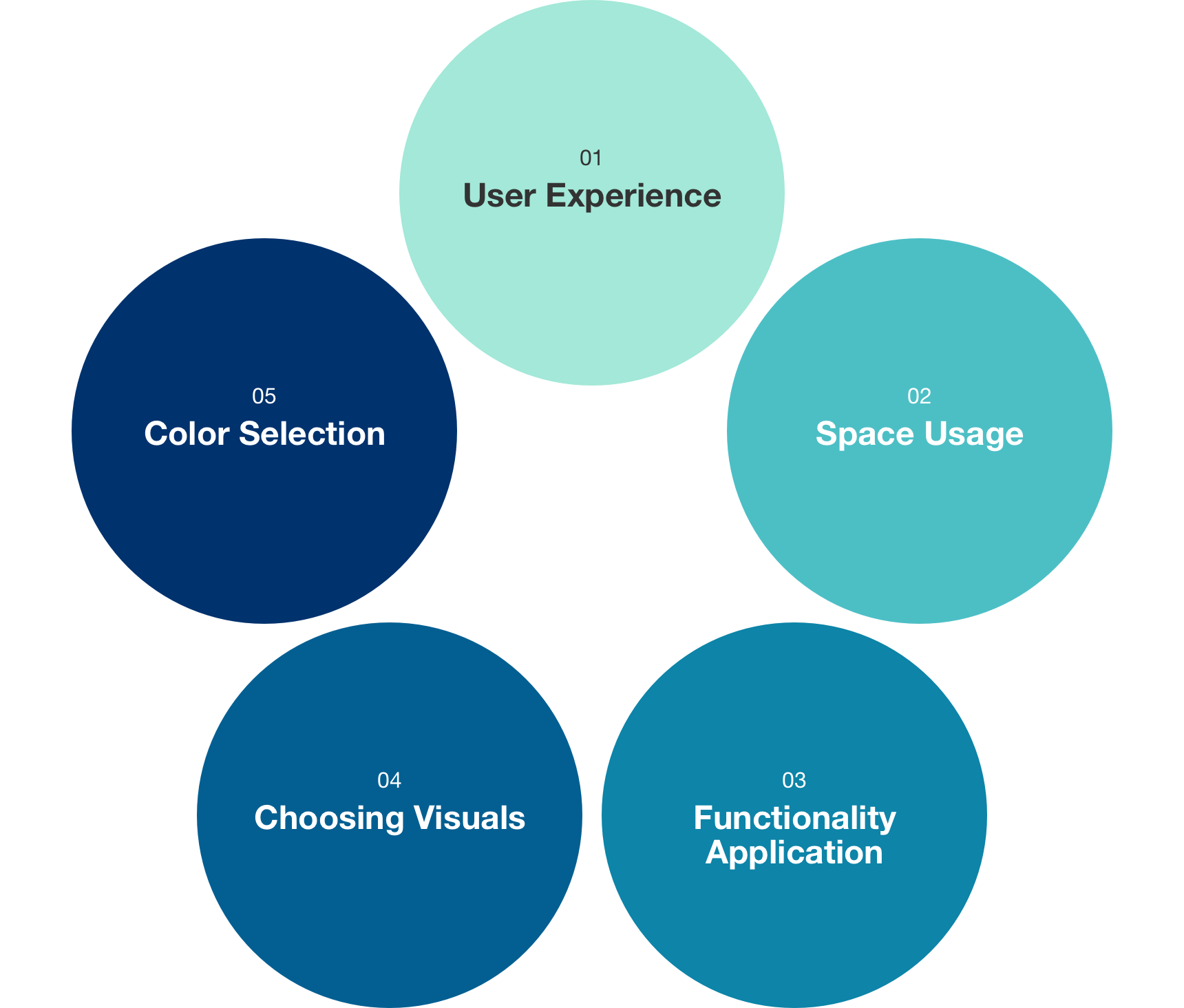
A great user experience
Constant awareness of your audience is your best guide. The way in which you visualize information depends on who is looking at it. For example, executives need to be able to make strategic decisions using financial data, so the data presented to them must be highly relevant. On the other hand, data presented to LOB leaders can be more general, and then more detail that directly affects their day-to-day operations can be provided.
Think of data visualization as art and of users as your viewers. The dashboard, like an art gallery, should show off your best work. The image you create with your data visualization must be easy to understand and intuitive. Key points should be clearly distinguishable from supporting data, and your conclusions should be easy to spot.
To ensure that users have a good experience, add a cover sheet that describes the dashboards included in the workbook, summarizes critical calculations and data sources, and makes it possible for users to go deeper as needed. It is also important to specify who publishes the dashboard and how frequently the source data is updated.
Breathing room
Never underestimate the importance of empty space in your dashboards. Blank areas keep the dashboard from feeling cluttered and distracting. Dashboards that are easy to read and don't tire out your eyes are a breeze for people to navigate and help them zero-in on the intended messages. Effective dashboards include a short and clear title, your company's logo, and blank space around the presented data, demonstrating that your visualizations have been selected to make your audience want to read your text.
Fewer functions
All the major data visualization tools include various bells and whistles in their feature suites. But in many cases, it is easier to convey the data story with fewer features. Keeping your dashboard simple and straightforward would benefit you, as the more complicated the features and graphics, the greater the risk of losing your audience.
Choosing well
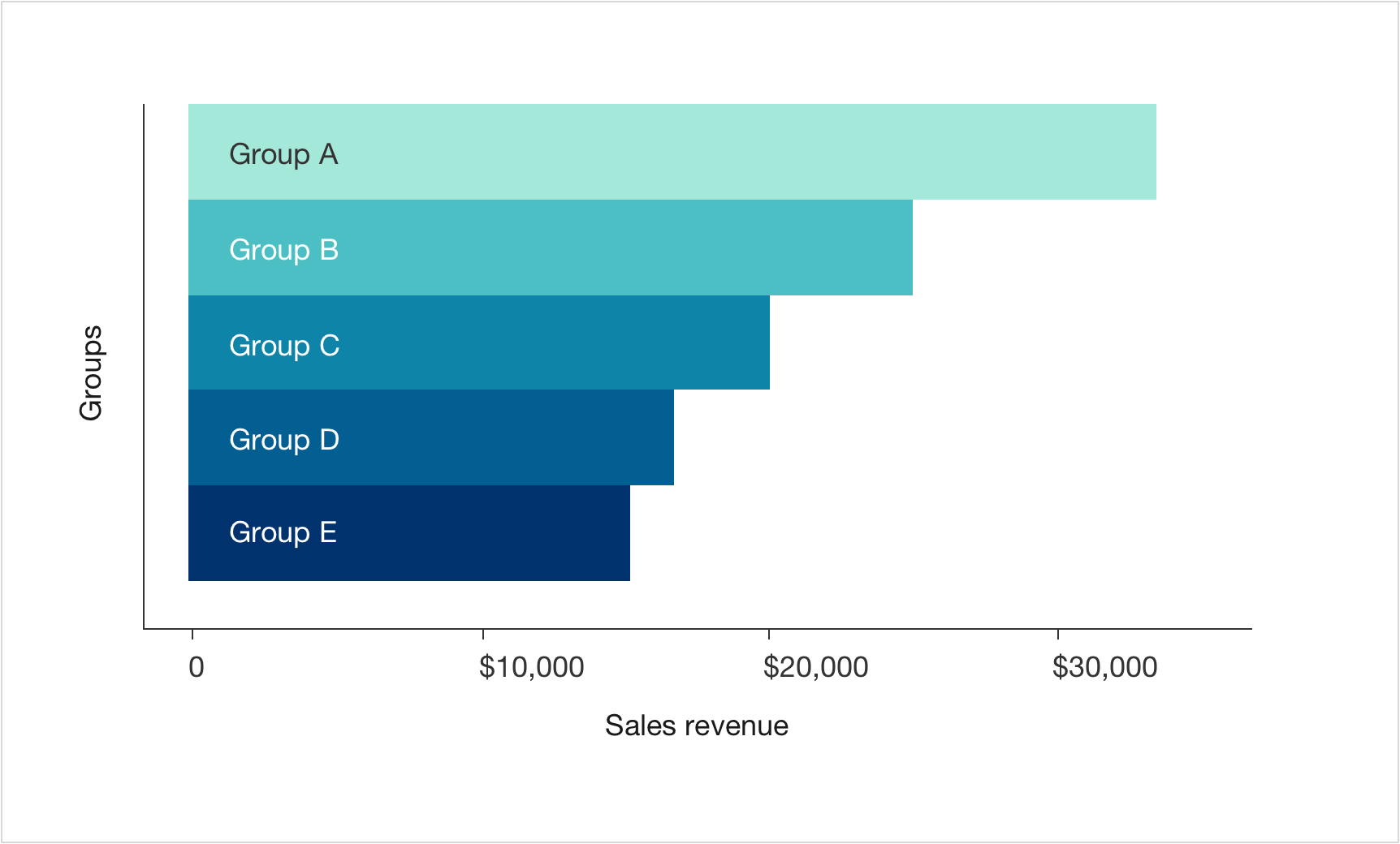
Your dashboard and overall presentation are more digestible for your audience when the visuals are relevant and straightforward. While all charts have their place and time, bar charts with filters tend to be more intuitive than complex boxplots that combine multiple data sets. Horizontal bar charts with discrete values look better on computer screens than vertical ones due to their proportions. These are things to keep in mind.
Color selection
When you paint a picture, color is very important. This is true for data visualization dashboards, too. Many visualization tools have built-in color schemes that you can choose from. As you do so, consider using your organization's color scheme as a guide. Remember that colors should be chosen so that people who are color-blind can see the same things as everyone else. Choose a variety of colors to create contrasts and to separate information.
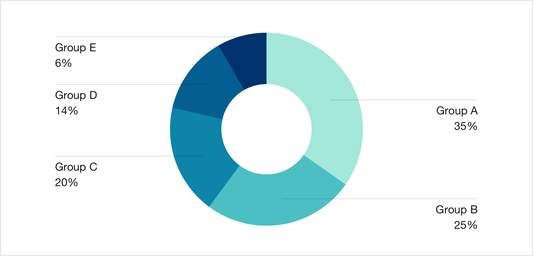
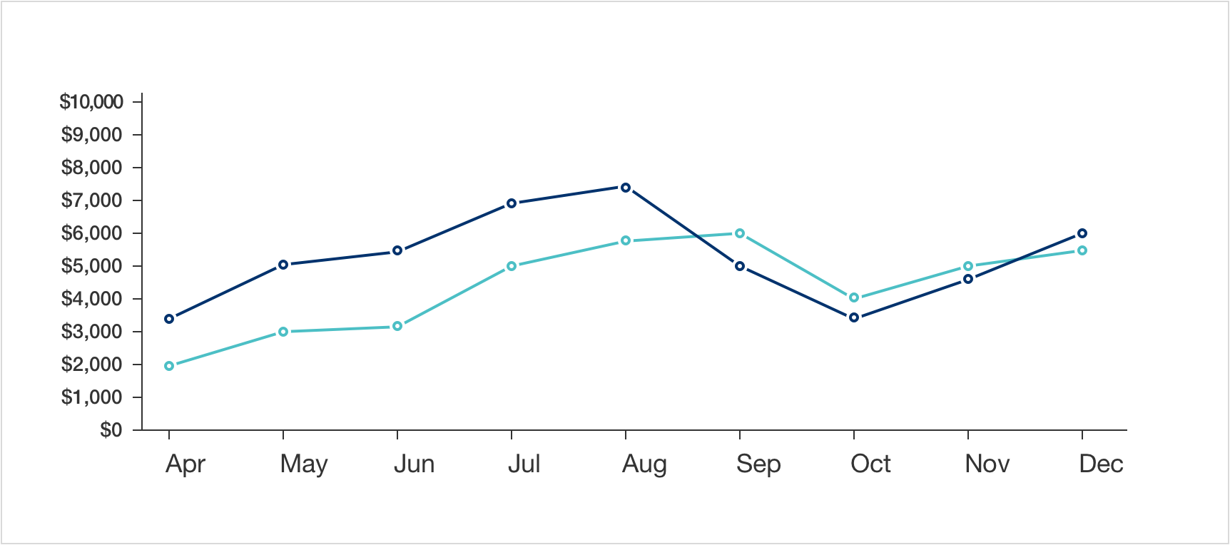
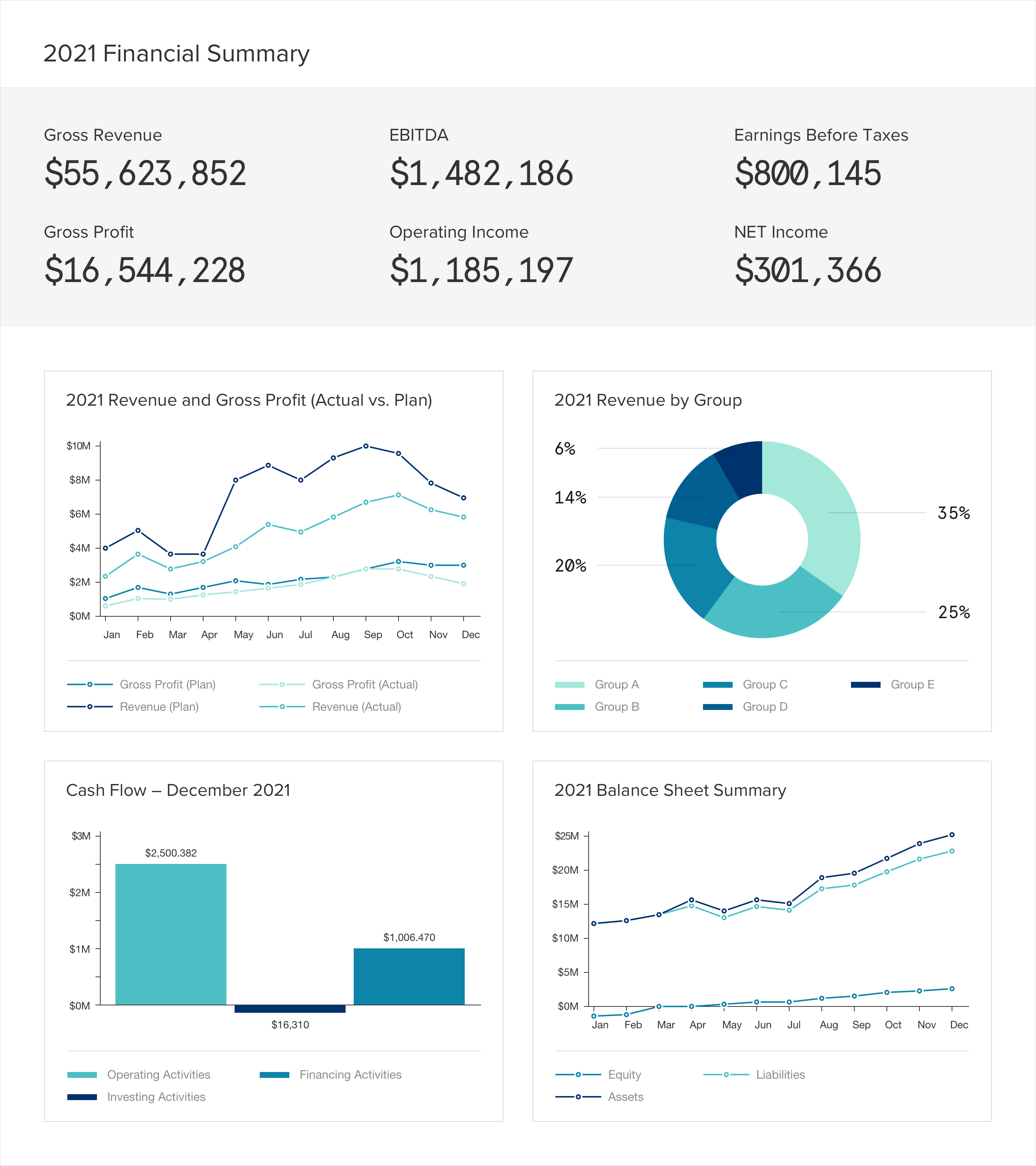
The image below shows some of these tips in action using a sample financial dashboard.
We plan to expand our data visualization blog series with recommendations for creating intelligent and persuasive charts, and more. Stay tuned!