This post examines touch-based user interfaces from a variety of industries and the extent to which their design adheres to or violates fundamental UI principles. We will determine the standards a modern touch interface should meet in order to provide users with a seamless experience that enables them to complete tasks efficiently and without incident.
We'll begin by comparing touch-based and mouse-based designs, demonstrating their differences and emphasizing the importance of aligning the design process with the ecosystem's nature. Then we'll review the major design principles that underlie the touch-based interface and examine some real-world examples, many of which, surprisingly, fall short of ideal standards. We want to emphasize that, in addition to adhering to touch-based interface design best practices, understanding user scenarios is critical to delivering a seamless experience. This should be followed by end-user testing and feedback integration. We hope you find the information contained in this article to be valuable.
Touch-based and mouse-based UI – key difference
Scale
When people interact with touch-screen devices, they do so with their fingers. A human finger has a larger surface area than a mouse pointer, so the mouse pointer will not be visible when fingers obstruct the view of the screen. Therefore, the physical dimensions of a human finger must be considered when designing interactive UI components and their spacing. Touch targets must be large enough to accommodate people's fingers. Apple's Human Interface Guidelines, for example, recommend a minimum target size of 44 pixels by 44 pixels, and UX Mag points out that the magic number for a touch target is 10mm.
Gestures
People communicate a great deal of information through gestures. Unlike mouse movements on a computer, gestures are entirely natural and make it easier to interact with the device, which enhances the realism of the experience. When people use traditional desktop interfaces, they develop an unconscious visual memory. A well-designed system of gestures on a touch-screen device additionally employs muscle memory, eventually transforming it into reflexes - a bit like keyboard shortcuts.
Input
Although keyboards are physically separate from computer screens, they are the primary source of information input. In comparison to a physical keyboard, however, a full-featured on-screen keyboard consumes screen space and slows typing speed. Therefore, when designing an interface for a touch-screen device, we must consider substituting for keyboard input wherever possible with other UI elements, such as carousels, scroll wheels, drop-down menus, and others.
Response
When we interact with physical objects–a mouse or keyboard–we receive an automatic natural response in the form of click/press sensations and sounds. Although our interaction with touch-screen devices is also physical, it lacks this responsiveness. It might be impossible to replicate this physical sensation when interacting with on-screen components. Nevertheless, it is possible to simulate it by sending visual and audio signals whenever the touch interface has detected an interaction.
Fundamental principles of exceptional touch-based UI designs
Hierarchy
The human brain processes a vast amount of information through sight, continually discriminating between the primary and the secondary, the essential and the inessential. That is why interface elements must conform to a clear visual hierarchy and to the rules of visual composition, with UI accents placed correctly.
The right visual hierarchy in user interfaces makes interaction easier and the user experience more pleasant, increasing productivity. Conversely, when the logic of visual interaction between elements is broken, people find it frustrating and difficult to obtain information.
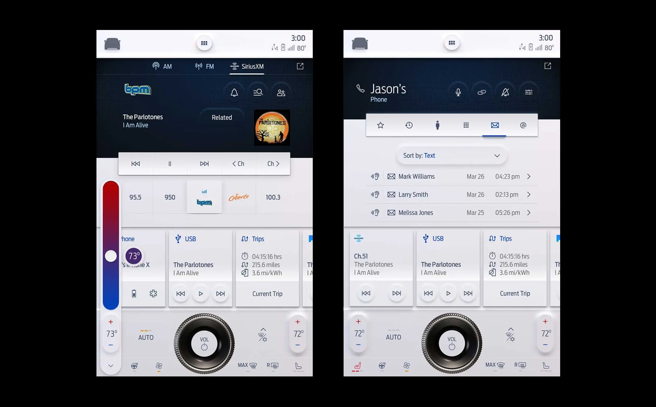
In this example, the principle of hierarchy is violated: it is impossible to quickly distinguish the primary from the secondary. As a result, it's not always clear which section you're in or where the main menu is located.
This interface also leaves no empty space. All of its elements are the same size, filling the screen evenly, with minimal accents.
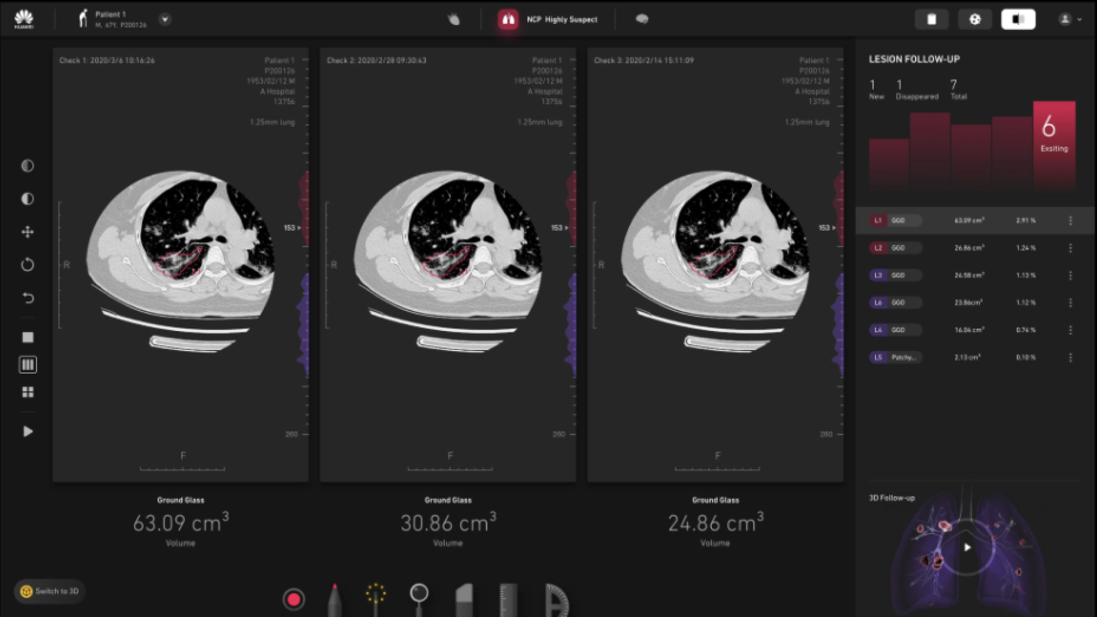
This example demonstrates the proper placement of primary controls–at the bottom of the screen–and a sensible visual hierarchy.
Despite the limited variety of graphic techniques used in this interface, it is easy to distinguish primary from secondary information. There is sufficient space for the eyes to move from one element to the next. Accent colors are also used properly here.

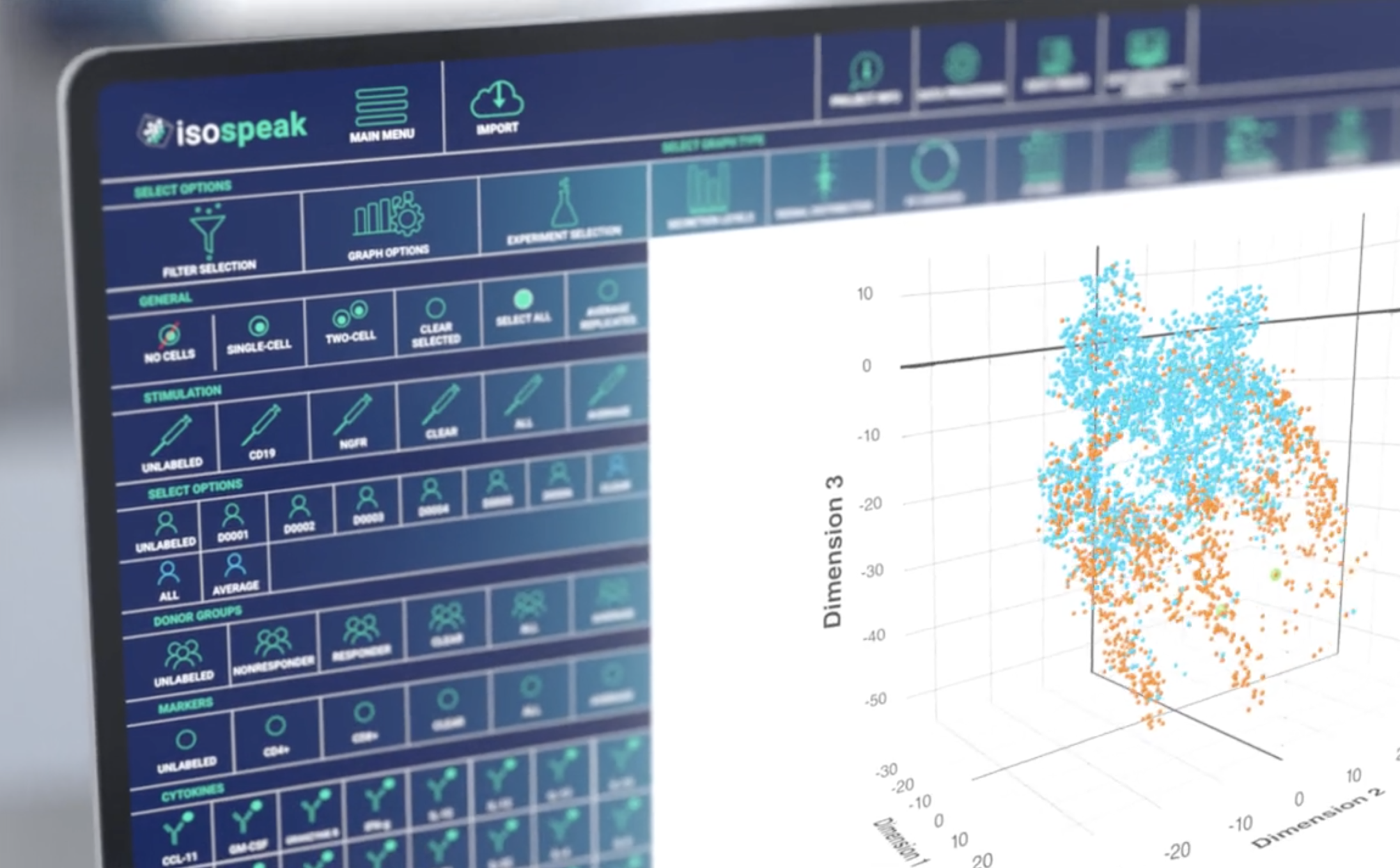
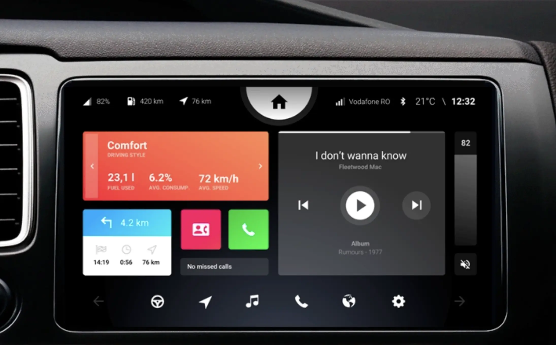
This interface is more visually complex than the one in the previous example. It has appropriate visual contrast and color accents, and a well-constructed hierarchy of elements makes it easy to perceive a large amount of information.
This is an excellent example of a modern color palette and clean graphics.
While it demonstrates a unique approach to color and iconography, as well as a minimalist approach to the use of space, this interface lacks visual hierarchy. All of its elements appear of equivalent importance, although this is not really the case.
This interface could be improved by clearly delineating groups of elements and adding color accents.
This is a more organized user interface than the one in the previous example. The UI elements are classified according to their intended use, forming the interface sections. These sections are then arranged in an orderly fashion – from primary to secondary.
While it contains a large number of elements, this interface’s ample white space makes it easy to navigate.
Simplicity
Leonardo da Vinci said that "simplicity is the ultimate sophistication." Simplicity is laudable for a number of reasons, not least of which is that the human brain tends to perceive visual information in the simplest ways possible. A streamlined user interface enables people to quickly see critical information without being distracted by superfluous elements.
Simplicity is critical for optimizing workflows and usability. A well-considered and simplified interaction flow can help users focus on the task at hand and complete it quickly, efficiently, and effectively. A well-structured and simplified interface requires little or no training.
This is an older version of the Tesla interface.
As you can see, this interface makes use of a variety of visual elements, including fonts, colors, icons, and shapes. Considered separately, each element appears to be well executed. However, when the elements are combined in a purely structured interface, the result reads as more intricate and visually cluttered than it actually is.
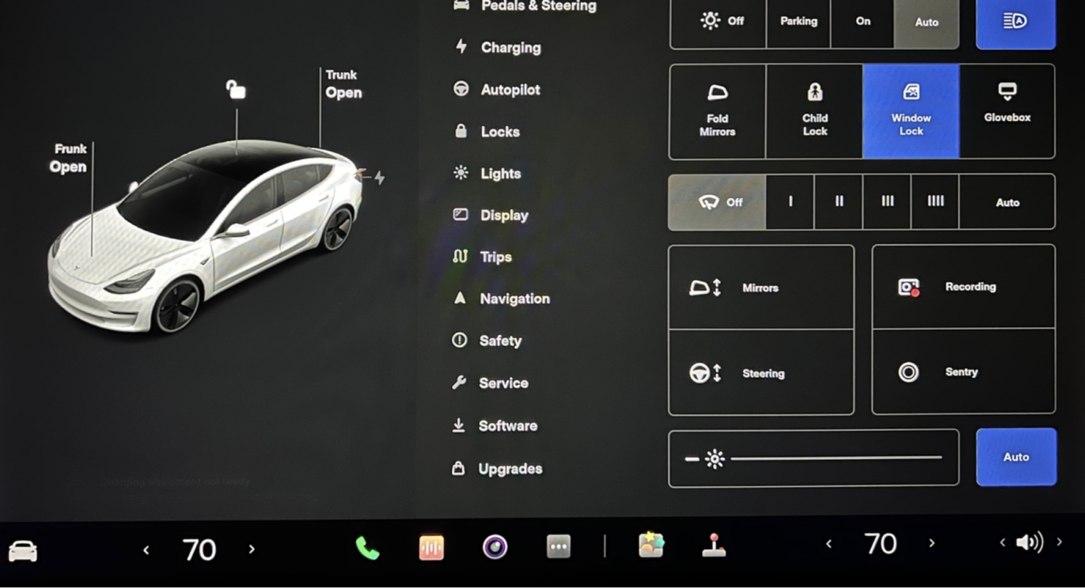
This is the current Tesla user interface.
Comparing the updated Tesla interface to the earlier one reveals a significant reduction in the number of UI elements, which makes the information on the interface more digestible.
The visual hierarchy issues that plagued the previous Tesla interface have been addressed. The UI elements are classified into sets based on their function. Ample white space permits the eye to travel easily from primary to secondary elements.
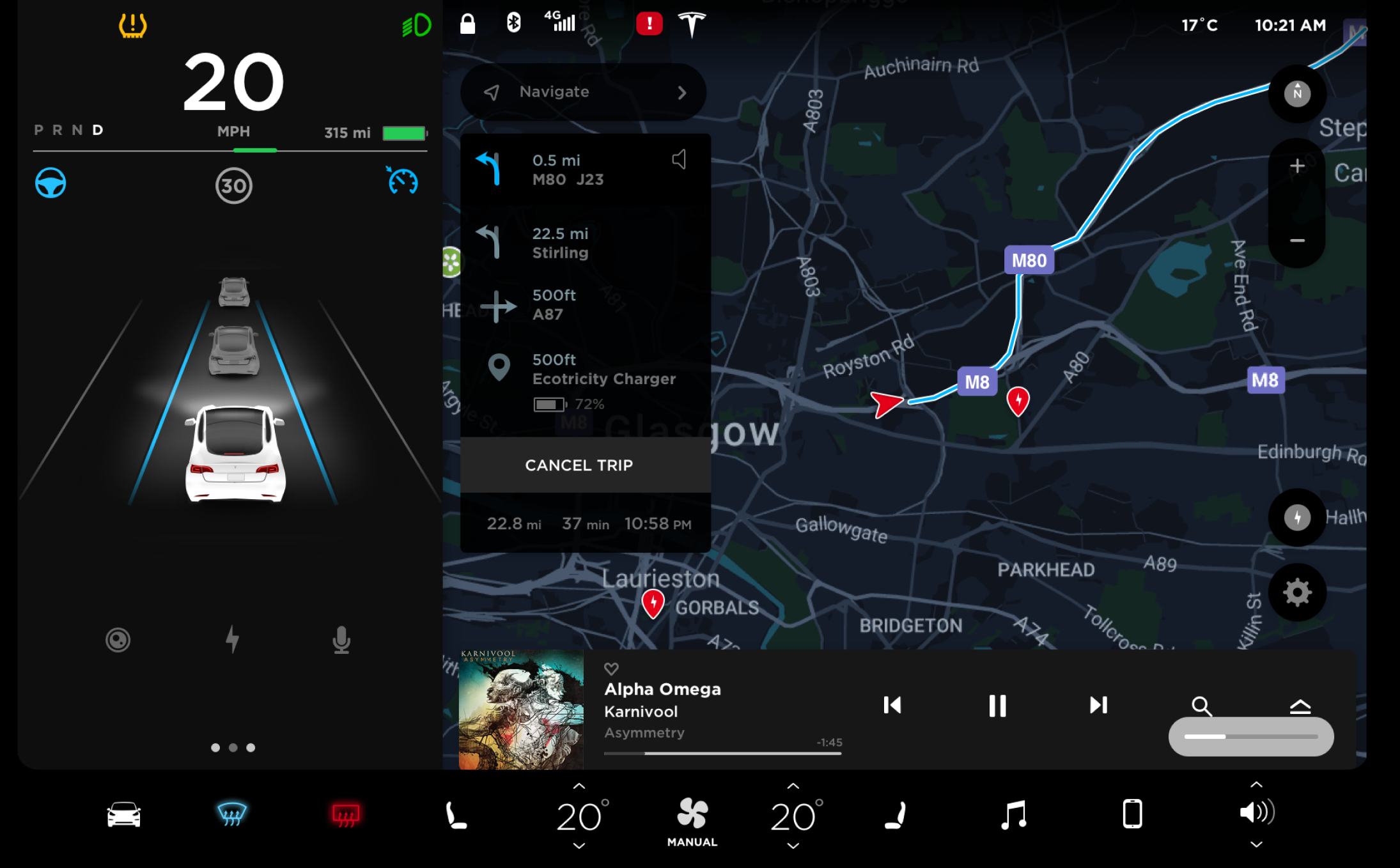
This is another example of a well-designed navigation interface.
Color accents are used appropriately, and the secondary UI elements are visually consistent, which aids in focusing attention on the relevant information without needless distractions.
This is an excellent illustration of a well-designed UI. This interface looks great due to its sparse use of graphic techniques and fonts. The interface is almost imperceptible, directing the user's attention entirely to the information.
Layout
Layout design is the process of arranging visual elements on a screen, such as text, images, and shapes. Layout design is critical for any project that intends to communicate a message through visually compelling imagery. The thoughtful arrangement of UI controls on a touch-screen device is an essential design principle, because in comparison to the mouse cursor, hand control requires a greater number of movements. If the UI controls are placed incorrectly, physical fatigue occurs more quickly, impairing the user experience.
The hand occupies a much larger area than the mouse cursor or pen. If we place UI controls in the upper area of the screen, we force the user to conceal a large portion of the information with their hand. All this should be considered when designing a touch-screen user interface.
This interface appears to be quite good at first glance. Upon closer inspection, however, we can see that some of the UI controls have been placed incorrectly. For instance, when a person uses the top menu, his or her hand covers the information on the screen. The same issue occurs with the controls located on the left side of the screen, as the majority of users are right-handed.
Additionally, the use of accent colors is ineffectual.

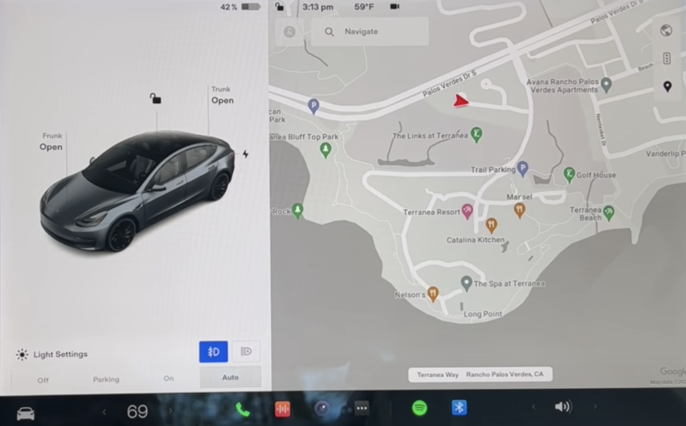
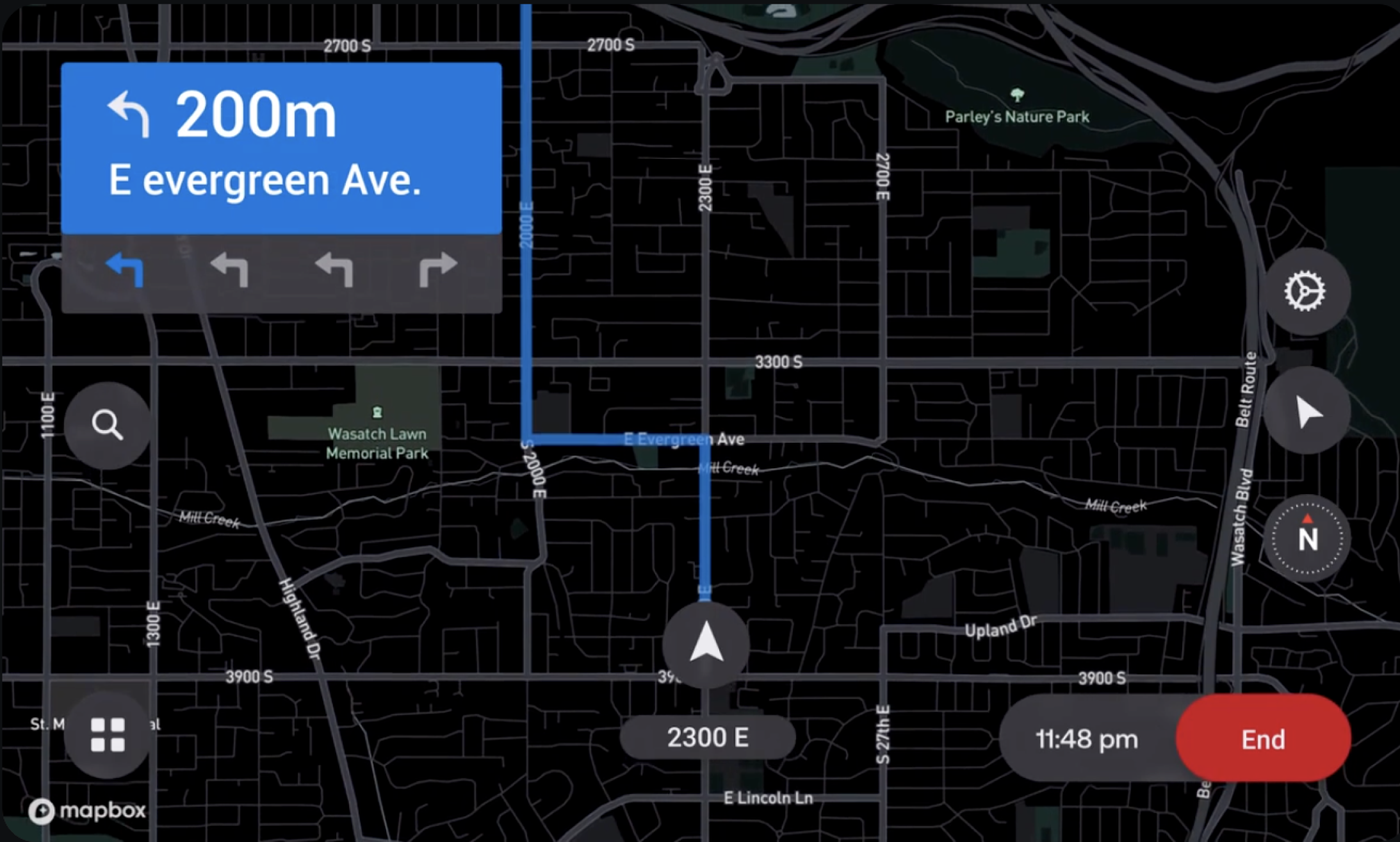
Comparing this example to the previous one, we can see that here the UI controls have been placed properly.
The small device's interface controls are located on the right, leaving sufficient vertical space on the left for information and preventing users from covering the information with their hands.
The larger device's UI controls are located at the bottom of the screen, which also serves to prevent information from being obscured by the user’s hand while working with the device.
This example is similar to the previous one. The UI controls are located at the bottom of the screen, leaving the information visible to the user interacting with the device.
Additional examples
While some principles of user interface design are debatable, one thing is certain: the best interface designs are simple, consistent, invisible, and empowering to users. We briefly discuss the advantages and disadvantages of various visual solutions in the following examples. This will help to clarify the elements that make for exceptional user interfaces.
This is an example of a less-than-ideal user interface.
This interface is missing a logical layout structure. Its design is ineffective due to excessive white space embellished with superfluous graphic techniques such as glow effects and gradients. This makes the interface appear visually cluttered despite the fact that it contains sufficient empty space.
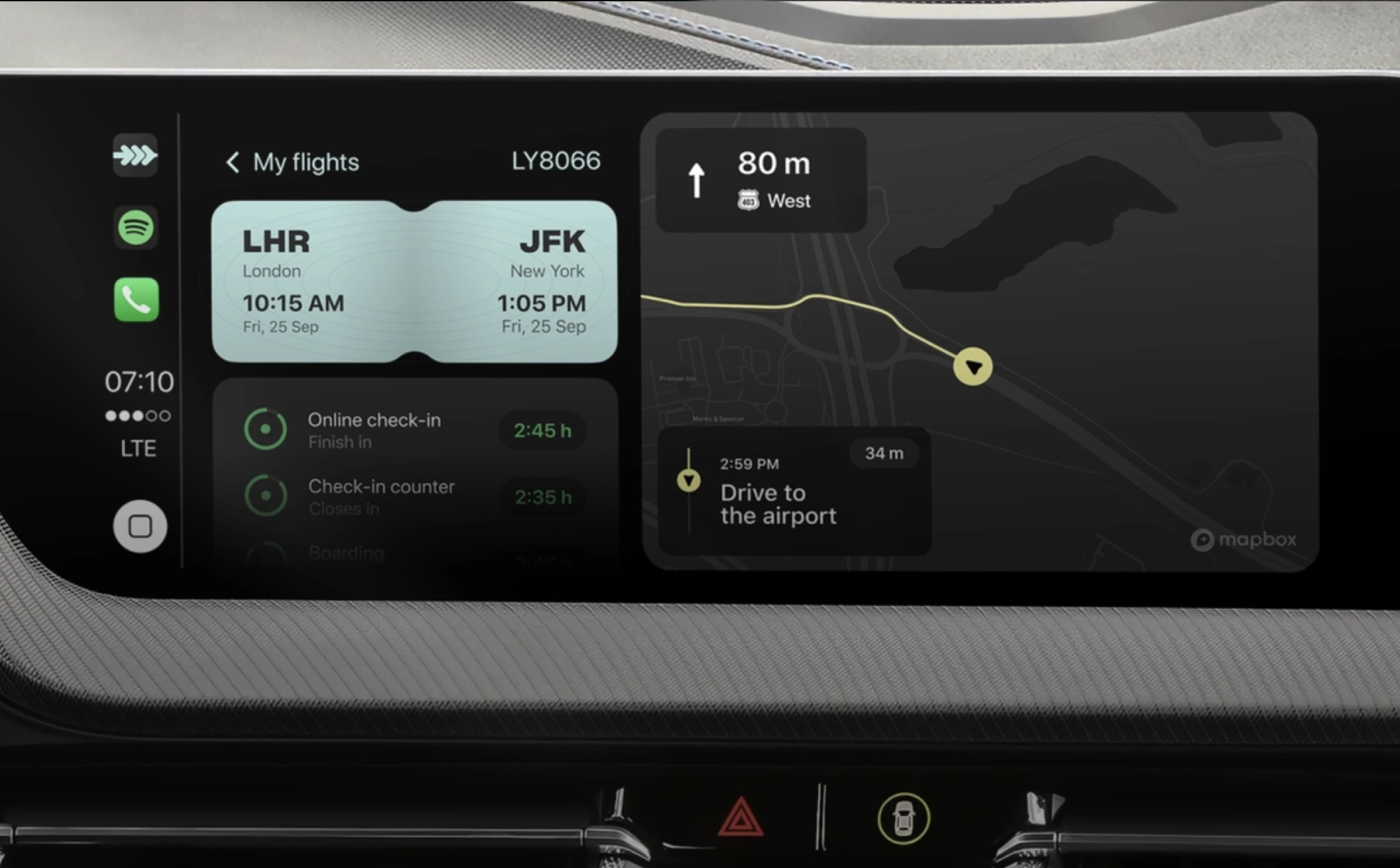
In comparison to the previous example, this is a proficiently designed interface.
Despite the small screen size, the information is easily digestible thanks to the interface’s proper layout.
This 2021 model luxury car's touchscreen looks like it might be from 2011.
The iconography appears unstable due to a lack of visual balance and a somewhat inconsistent style.
The interface also looks outdated due to the excessive use of gradients, shadows, and highlights. More than a decade ago, skeuomorphism was trendy. Today however, design produced in this visual style appears unfinished. Surprising, for a brand of this caliber.
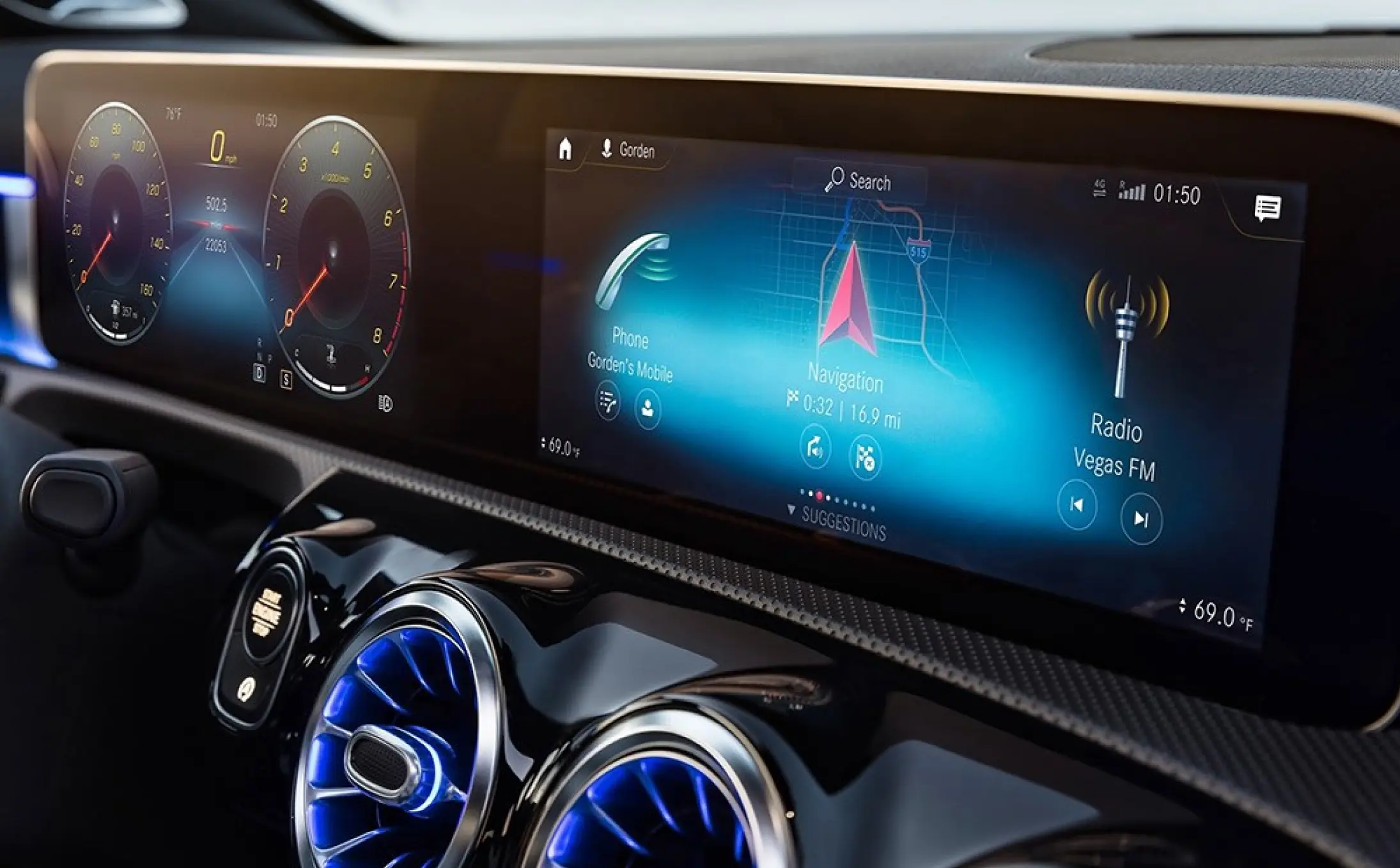
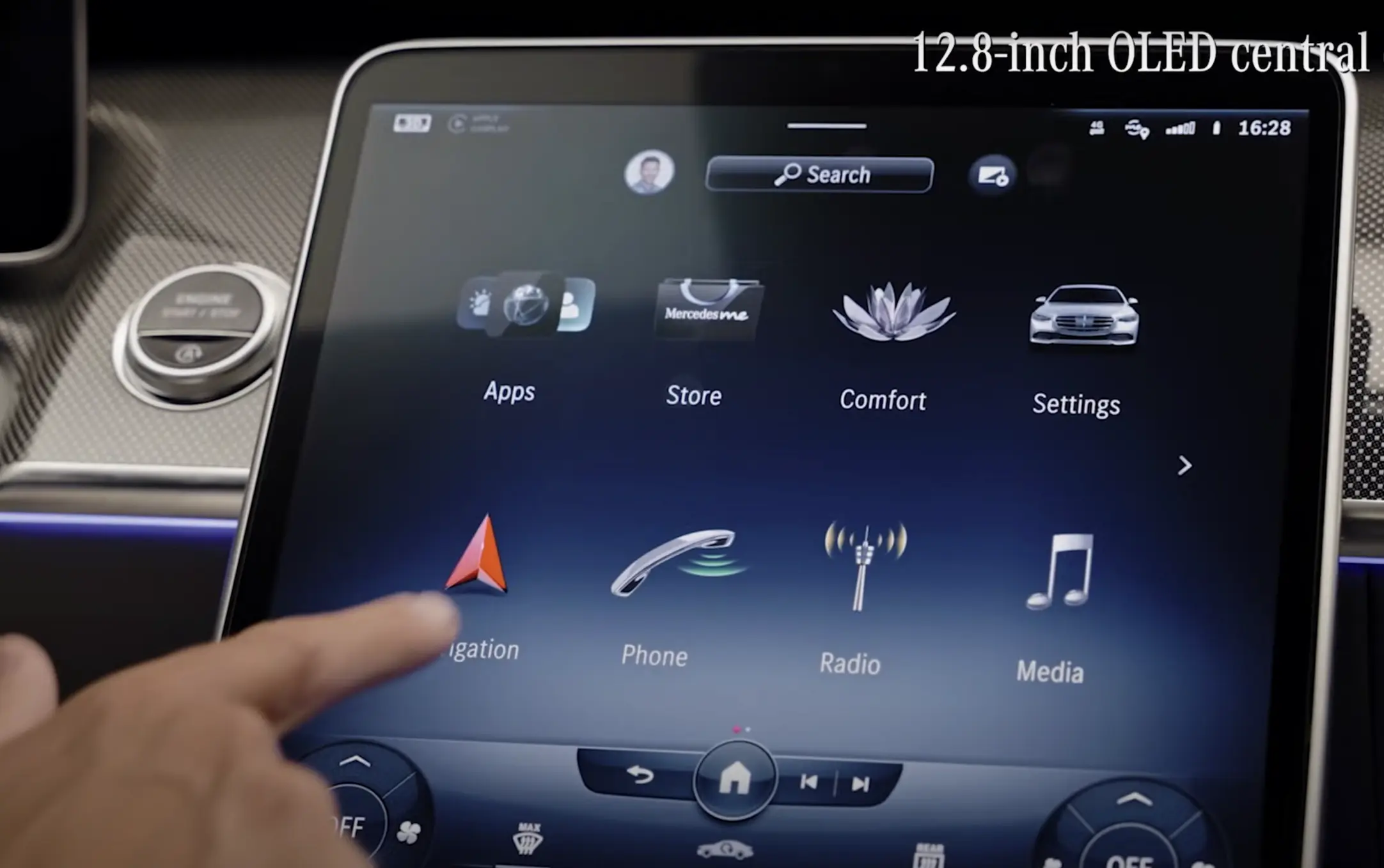
This is a better example of a touch-screen interface for a car.
As we can see, many previous visual issues are addressed by simplifying and unifying secondary UI elements. Correct spacing and layout contribute to a more structured interface.
This clearly demonstrates that it is not the style of the design that determines its quality, but the understanding of and adherence to design rules.
Let's keep the automotive theme going.
This is a Ford pickup truck's touch interface. Its UI elements are grouped into several transparent blocks that take up the entirety of the available screen space. This visual solution is on the right track, but the designer seems to have got carried away with the form and overlooked the function. The interface is over-designed, impairing readability. The three-dimensional lines, buttons, and strokes, for example, consume an excessive amount of space, cramming the information into boxes and fading it into the background.
This example features the same "blocky" type of interface as the previous one, albeit in a more polished design execution. This interface appears to be more straightforward, though the designer seems undecided about the typography or whether to use gradients or limit the design to flat color.
The same "blocky" design approach is found in this great example of a touch-screen automobile interface. What makes this interface much more attractive, is the restraint exercised in terms of the number of graphic techniques used. There’s also an excellent use of typefaces, color, and shapes, a well-defined hierarchy, and balanced spacing between elements.
Although this interface is very specialized and at first glance might appear uninteresting, we have chosen to include it, because it is expertly and purposefully executed.
Individuals who work with devices such as this one spend a significant amount of time looking at them. Any factor that diverts their attention may produce visual strain. Therefore, the information displayed on these panels is critical. That is why this interface is virtually unnoticeable while also being easy to read.
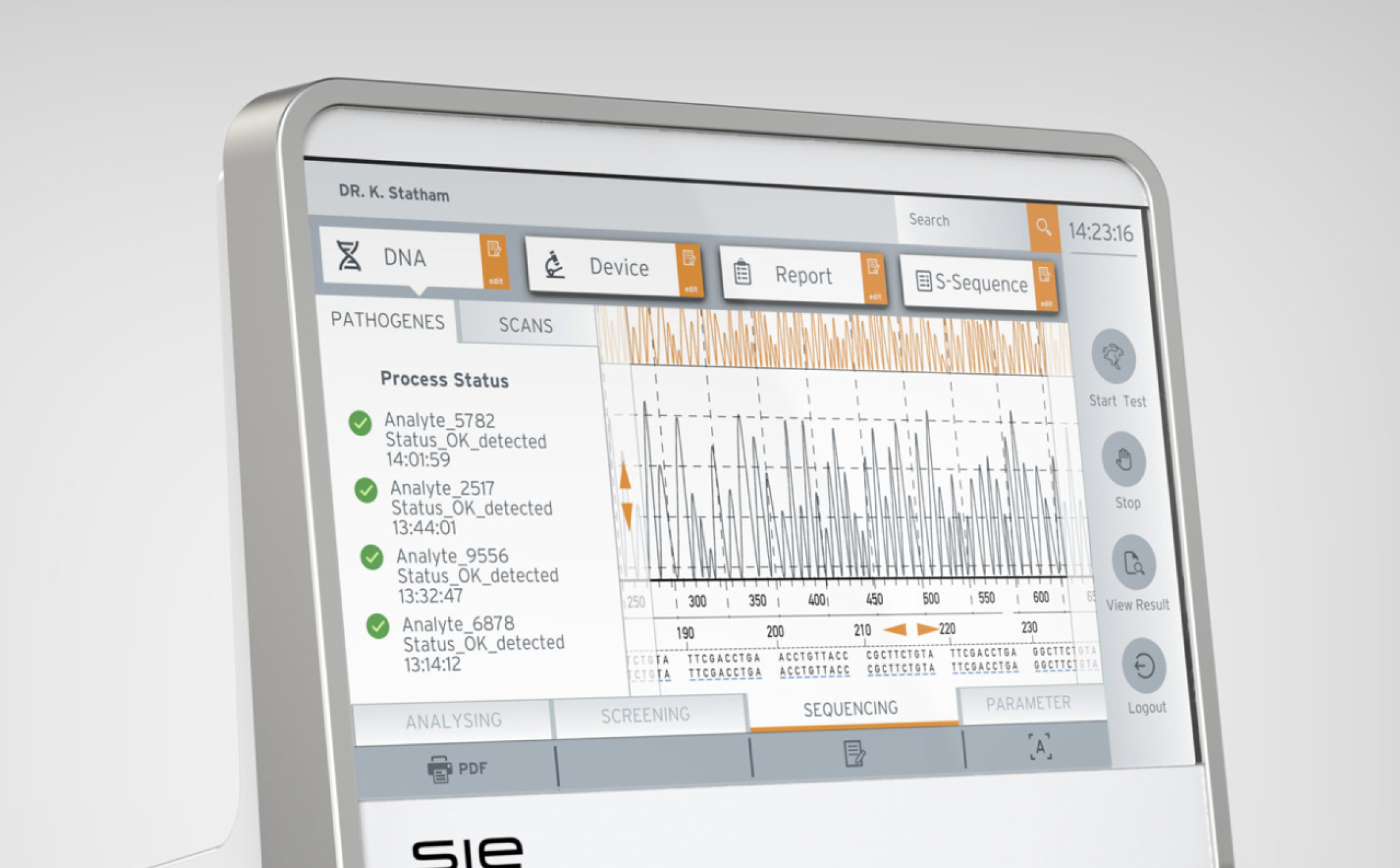
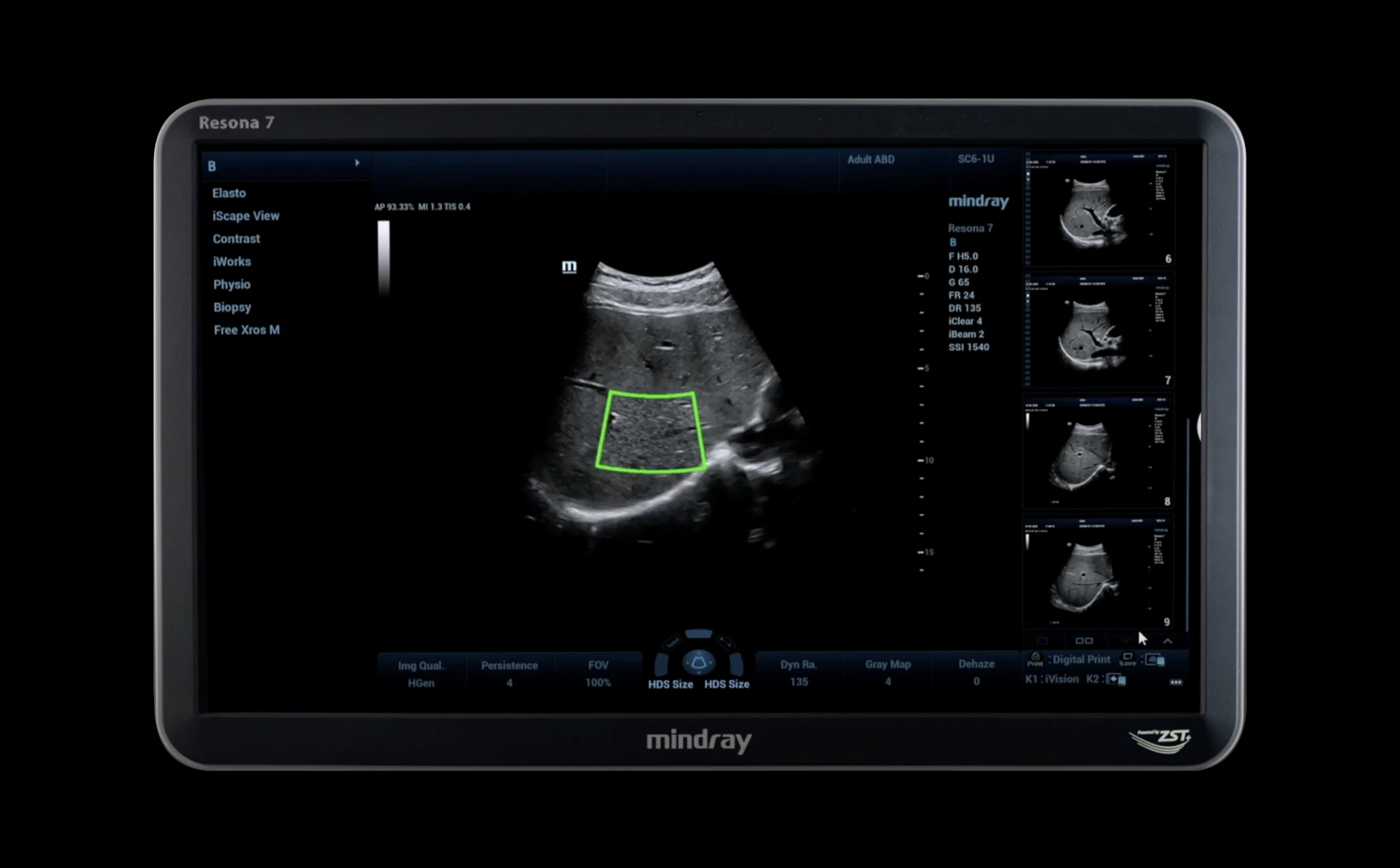
This is another outstanding example of a contemporary scientific interface.
It is another masterful execution of the "blocky" interface. Primary content takes up the central area, with secondary information accessible but unobtrusive. This interface maintains a consistent visual style, with a sensible color scheme that does not detract from the core content. Everything is in its proper place.
This interface design does not make extensive use of graphic techniques or tricks, which is a big plus. To improve this UI design even further, it would be necessary to delete some superfluous UI elements, such as the frames around text beneath the devices. Further work on the distances between objects would also be required, the style of the icons in the menu would have to be unified, and the minor accents would need to be made clearer.
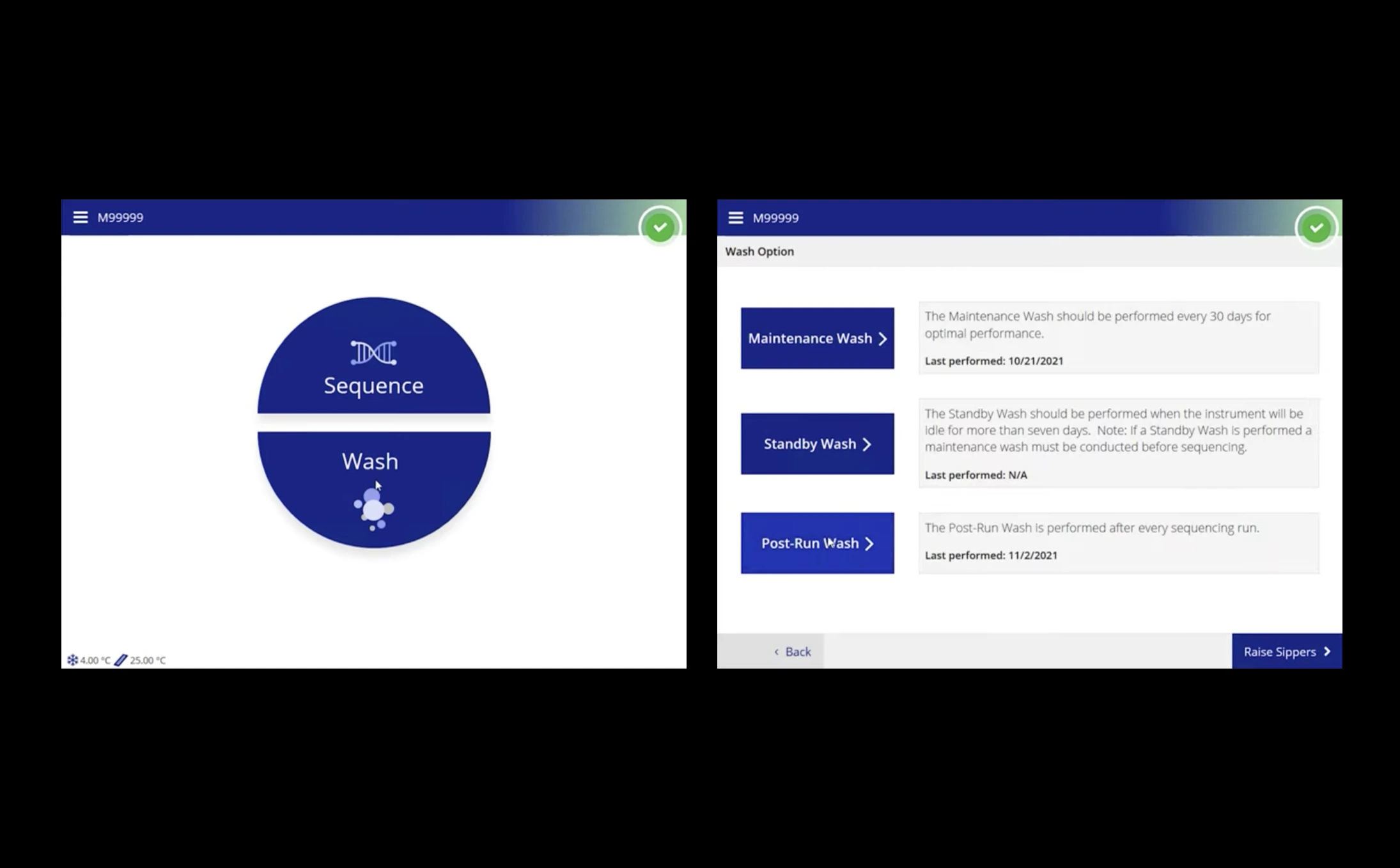
This interface looks more like a wireframe but not as a complete UI design. This interface's visual state might be suitable for user testing, but it requires the proper design phase to look like a finished product.
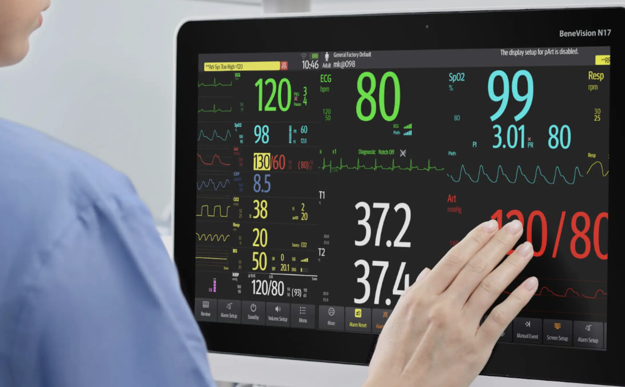
Although this is not a touch device, it is an example of a great user interface.
The unobtrusive control block does not take attention away from the information area, and the text is consistent in appearance. The fonts and uniform icons are well-balanced. The UI elements are organized into blocks that create a natural visual hierarchy. A rare example of an outstanding user interface.
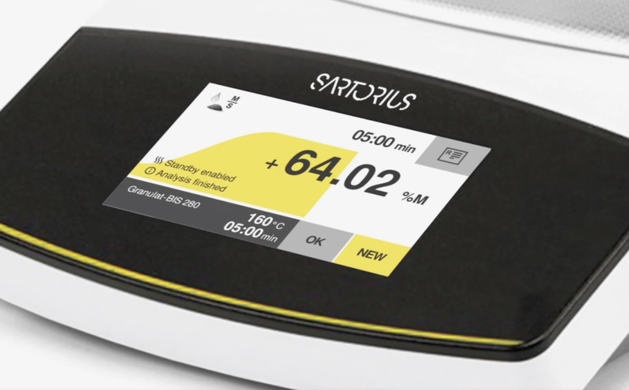
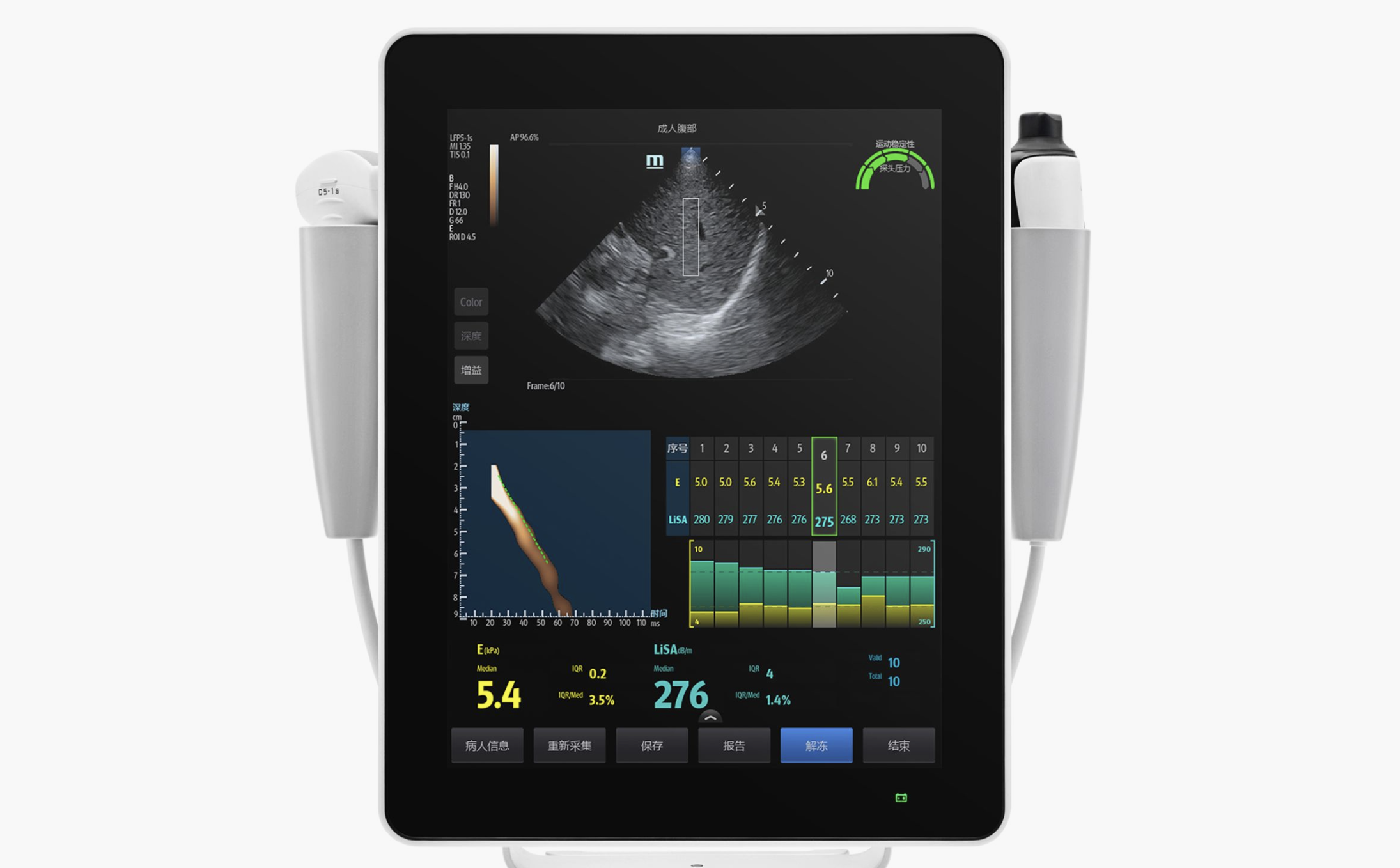
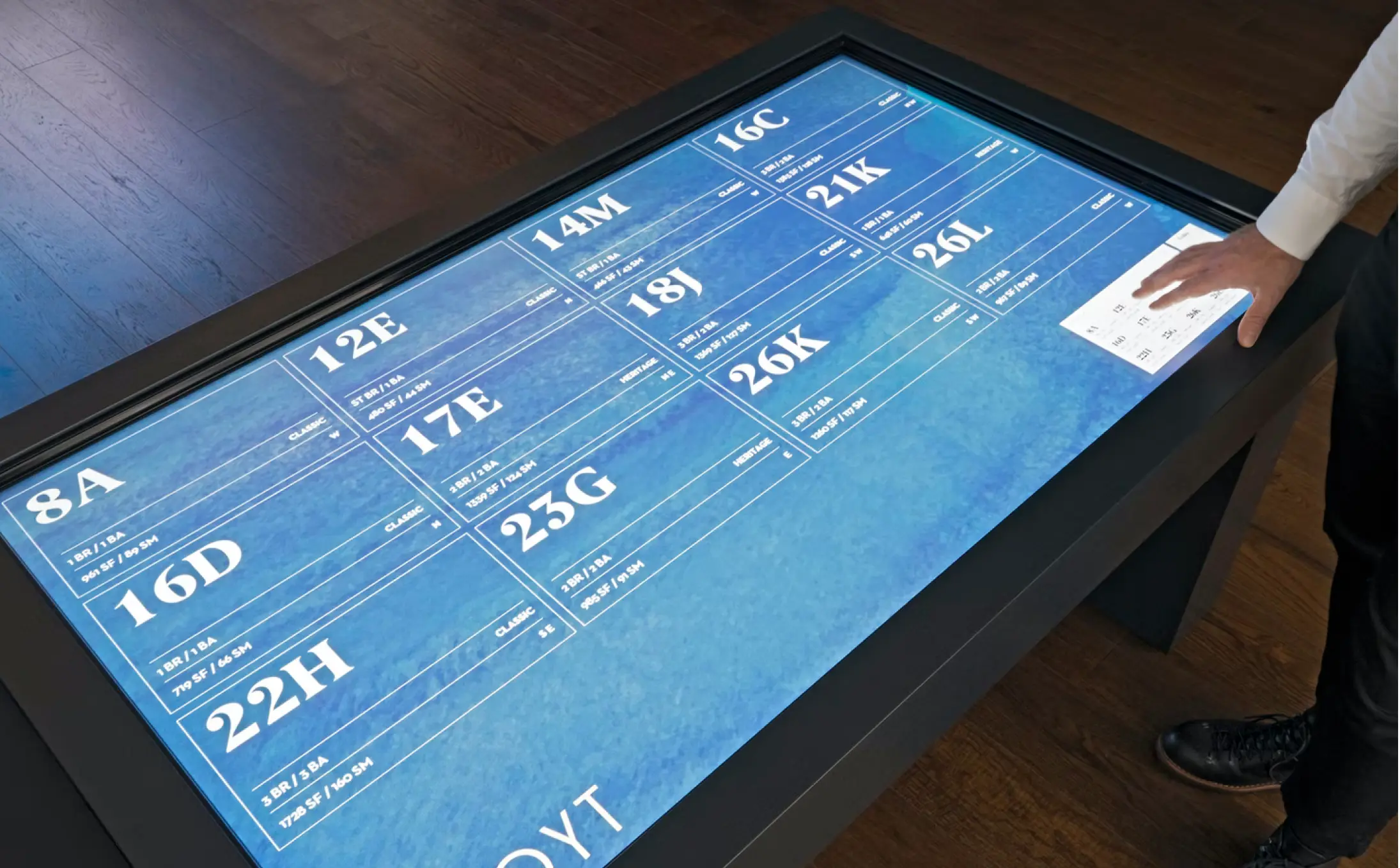
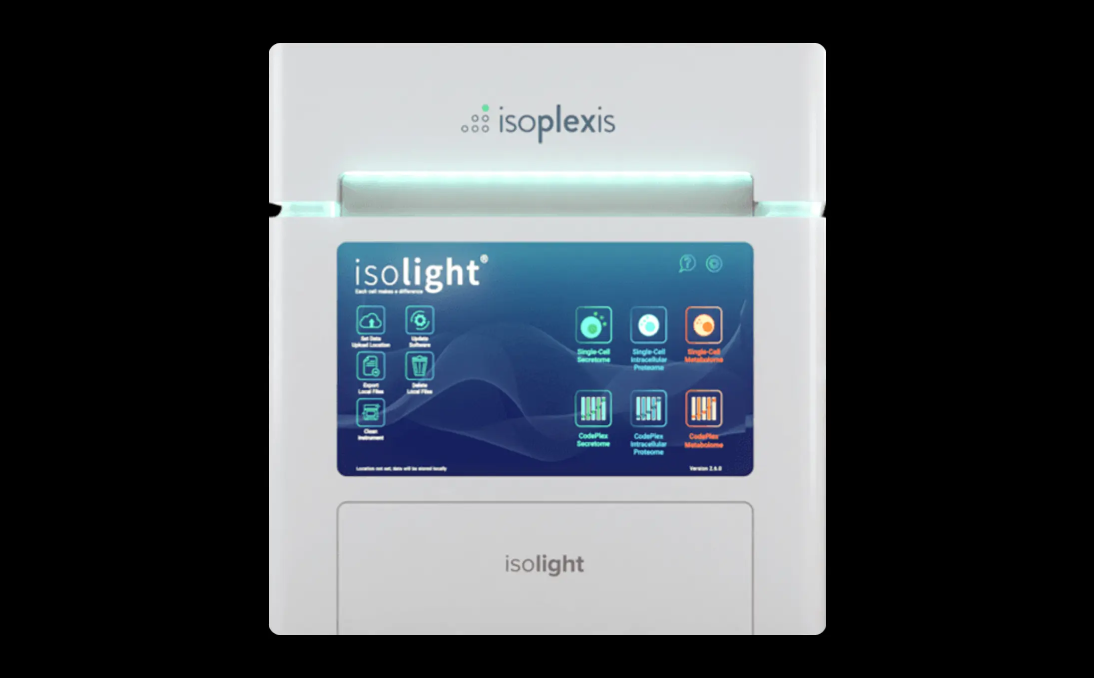
This Sartorius interface series is one of the more impressive examples in this study.
Although this device has a small display area, the designer was able to organize information in an amazing user interface. This interface looks great as a result of various design techniques, including a single accent color, high contrast fonts, obvious visual accents, excellent shape work, and imaginative use of white space. Please note the way the graph occupies the same space as the text without interfering at all. Bravo.
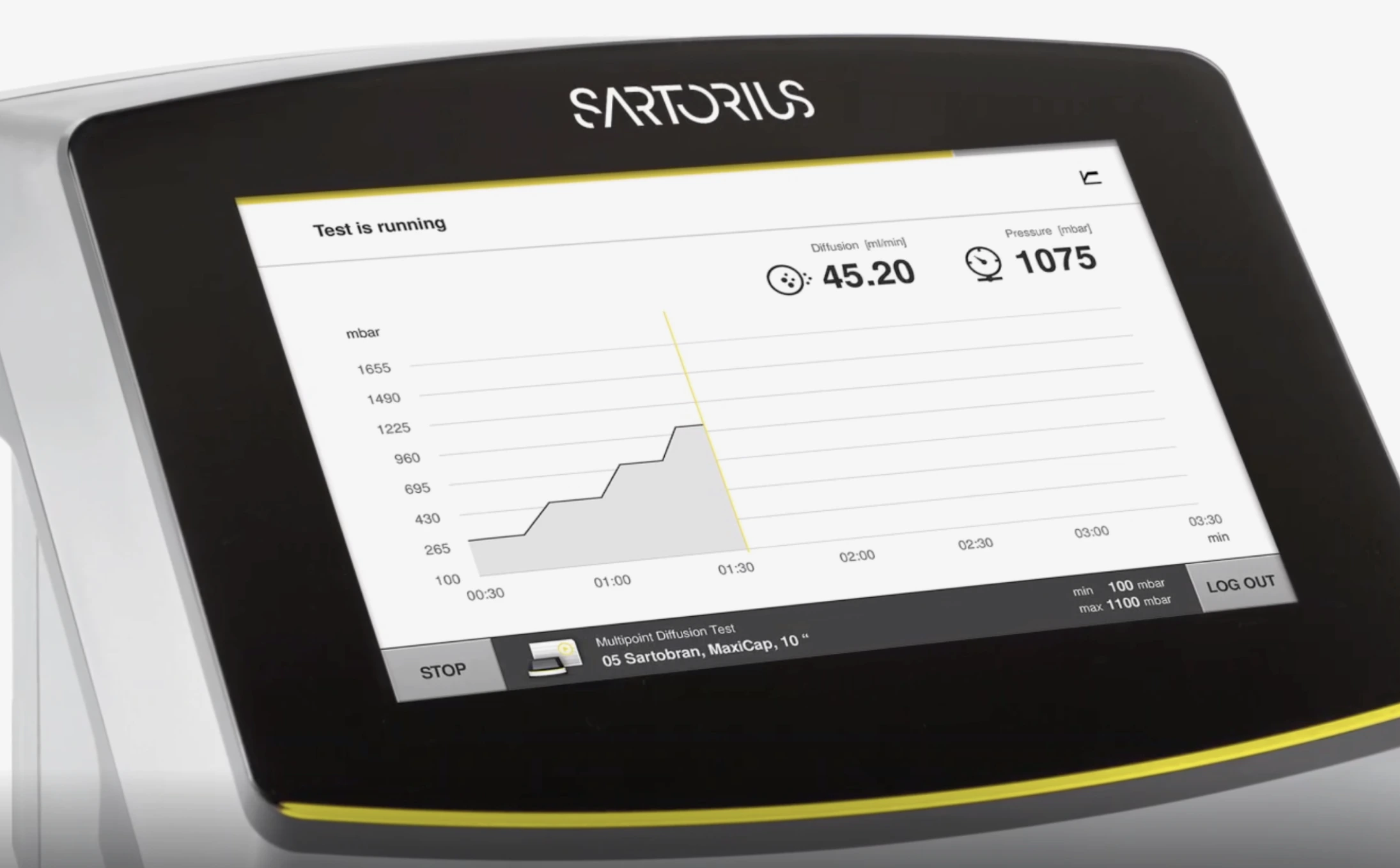
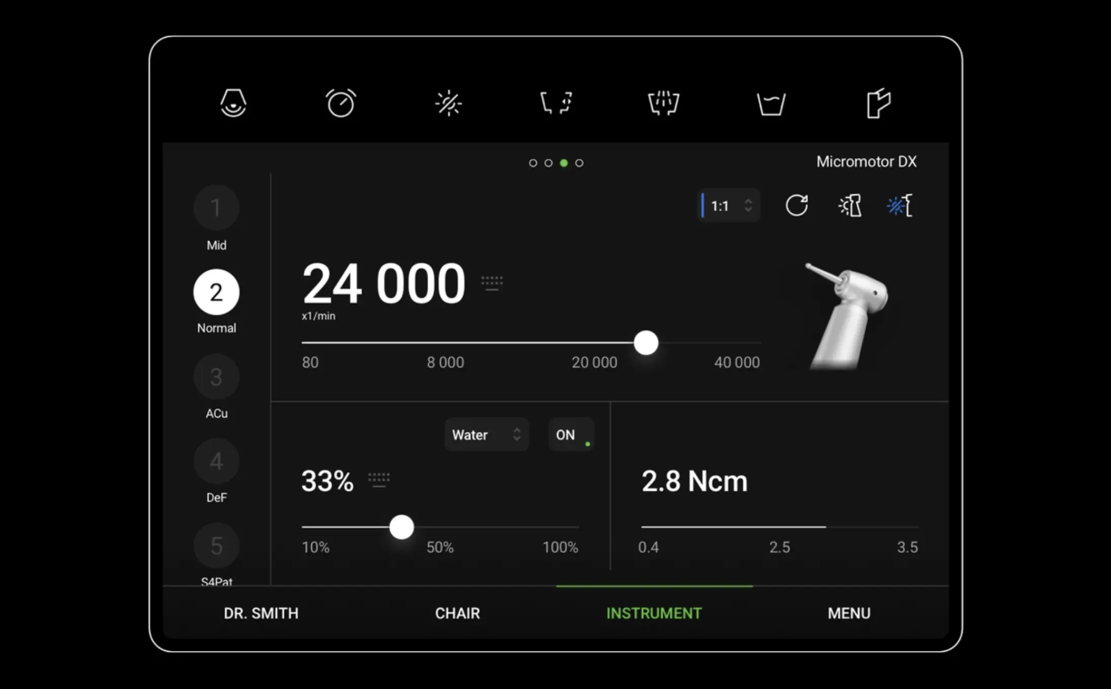
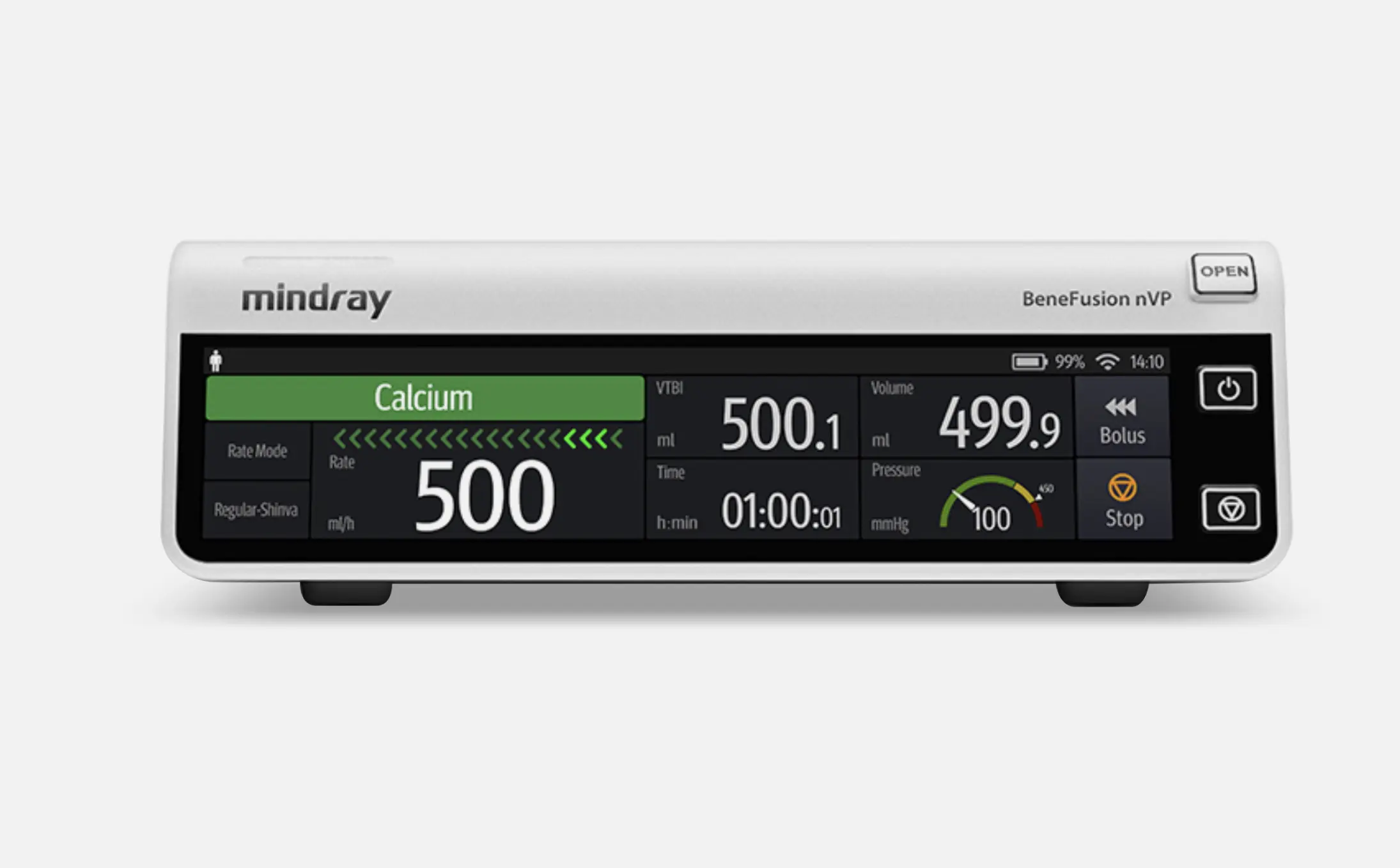
Another good example from the Sartorius series. Perhaps we would not have chosen to use 3D buttons on the control unit, but this is a cosmetic choice, and the style of these buttons has no bearing on the interface's structure. In general, the interface is excellent for a device of this size.
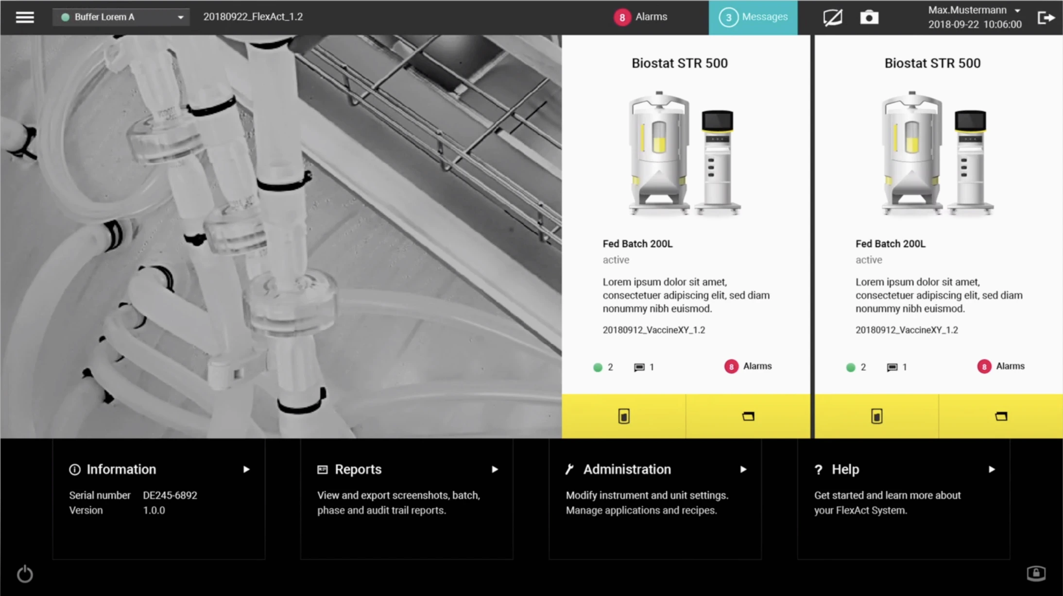
This is an example of a large-screen interface. As the number of elements increases, more accent colors must be added, which the designer did here. The color palette is well chosen, and excellent use has been made of shapes and blocks. Minor issues can be pointed out with regard to icons, alignment, and fonts, but because the major work is done well, these do not detract from the UI's overall appearance.
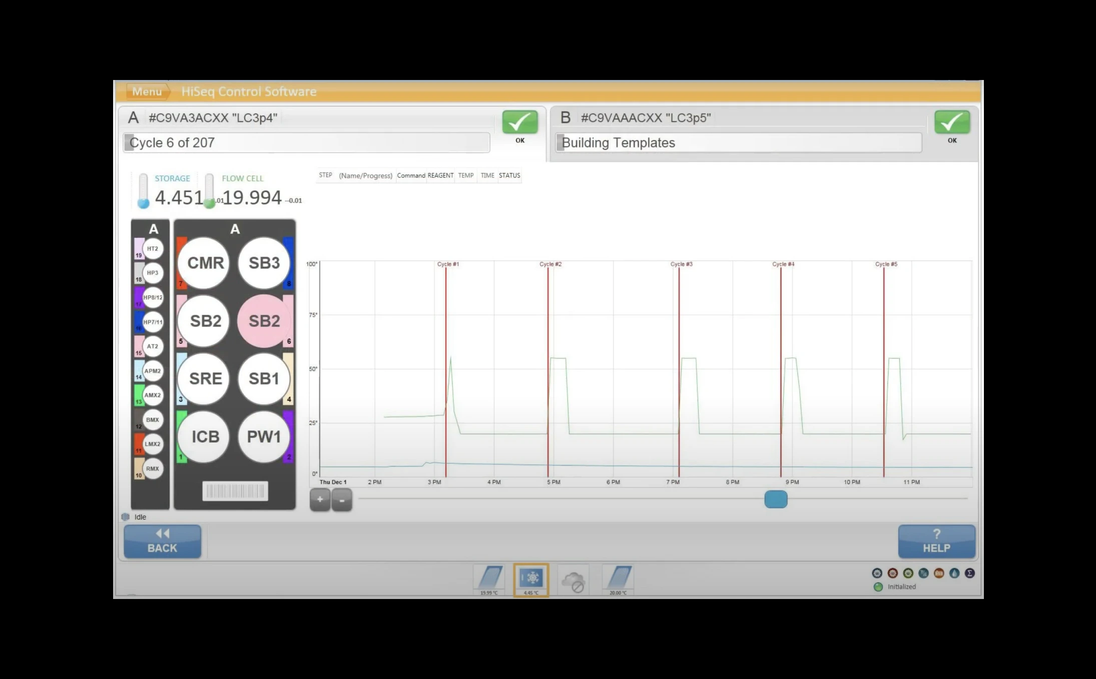
This sequencer's UI is visually out of date, it is typical of the "old generation." Even ignoring the aesthetic, however, it is evident that the essential UI design work has not been done here.
It bears repeating that the quality of an interface is defined by how well it adheres to fundamental design principles. An interface can look outdated because it makes use of older visual trends, but still remain functional. In such a case, it would simply have to be updated stylistically. That, however, would not work in this instance.
This is a more recent version of an interface by the same company. Its design has shifted away from outmoded shiny buttons in favor of a more contemporary use of color. It has transitioned from intricate forms to simpler ones. Nonetheless, inefficient use of white space, poor handling of the typeface, and the use of a single color for all accents render it unsatisfactory. Proving once more that using trendy visual tricks alone, without adhering to essential rules of UI design, does not yield a good result.
The importance of suitable hardware for the seamless touch experience
On a touch-screen device, visual elements are not just images. They are virtual objects that people must interact with confidently. To provide a seamless experience, the device must meet several requirements:
Hardware must be sufficiently advanced to respond quickly to interactions. To be perceived naturally, taps, swipes, drags, and pinch-zooms must occur without perceptible delay.
A matte anti-reflective screen finish is critical for touch-screen usability. It minimizes both light reflections and fingerprint traces that inevitably form on the surface during use, both of which hinder readability and increase the frequency of device maintenance.
The screen's viewing angle is another important parameter. People might need touch-screen devices not only for direct use, but also for remote monitoring of processes and information. Data should be visible without distortion from any angle.
We recommend that you consider these points wherever possible when selecting a device.
Conclusion
With current developments in digital product UI and UX design, the small number of truly high-quality touch-screen interfaces across multiple industries is truly surprising.
The UI design principles and examples presented in this article do not exhaustively cover the subject of creating exceptional touch interfaces. Nonetheless, we hope that we were able to shed some light on the nuances involved in designing an effective interface.
Understanding the fundamental principles of UI design and human perception of visual information is critical when creating modern touch interfaces. It makes it possible to build a flexible product that can be easily adjusted and further developed as needed in order to meet both user needs and business objectives.
A well-designed touch-screen interface significantly simplifies interaction with data, optimizes workflow, and saves company time and resources. Finally, and perhaps most significantly, it brings joy to employees as they use it.
If you need more information on usability research of touch-based user interfaces or related topics, don't hesitate to get in touch with us: info@dworkz.com