
Data analysis is an integral part of the day-to-day operations across multiple industries. It provides decision-makers and regular employees with valuable insights, helping them map out strategic plans. The results of thorough scrutiny of individual data points and complex data sets are leveraged as expert tips to increase conversion rate, ramp up user engagement, and take business performance to the next level.
However, to truly reap the perks of an in-depth analysis of business data, data processors need to effectively manage the information. This calls for heavy data visualization techniques as a vital element of business solutions.
In this article, we will break down the basics of data visualization, uncover its best practices, and share real-life examples of data visualization used by big-name brands and non-profits.
What is data visualization?
Data visualization is about turning data sets, especially large and complex ones, into visual formats using digital data visualization methods and tools. These can range in nature and degree of sophistication, embracing multiple ways to visualize data — from basic Excel spreadsheets to sophisticated charts, diagrams, and graphs featured on high-end business intelligence (BI) tool dashboards.
But why do people need to visualize data? Why not just stick to raw figures and numbers without resorting to all these pictures and infographics? The answer lies in the psychological peculiarities of the human brain. Research shows that we process images 60,000 times faster than written texts, especially long rows of numbers. This means that presenting raw information visually boosts people's efficiency in comprehending, interpreting, and analyzing it.
If data visualization is handy in everyday life, it is mission-critical in business. In healthcare, it helps track disease outbreaks and patient outcomes. In finance, it monitors market trends and detects fraud. In retail, it optimizes customer experience and inventory management. Knowing which data visualization to use and when entrepreneurs can boost staff productivity and gain a competitive edge over rivals who overlook the multiple data visualization use cases in their workflow.
So, let's explore the perks of making data visualization a pivotal feature of your company's data-handling routine.
Unlocking the benefits of data visualization
With 20 years of experience in data-driven software management projects, Dworkz understands the immense advantages of well-organized data visualization.
Providing data accessibility
Data silos can cripple an organization. Information needs to flow freely between departments and employees. When you know how to visualize data, making it understandable to various stakeholders, you eliminate confusion and alternative interpretations, creating a single source of truth. This shared understanding helps staff cooperate better, align their interpretations of facts, improve communication, and foster teamwork.
Creating an interactive experience
Top-notch data visualization examples are interactive at their core. Users can manipulate them, explore various data points, and view the numbers from different angles. This interactive capability of data visualization techniques turns routine data processing into exploratory analysis, allowing for a deeper understanding of available information.
Determining key points
With raw data, pinpointing significant information can be challenging. Data visualization brings critical information to the forefront, enabling personnel to focus on it instead of sifting through numerous figures in search of crucial insights.
Enabling data comparison
The best data visualization examples make it easy to compare data points. Line graphs and bar charts for visualization are among the most common methods, simplifying comparisons and helping employees see the big picture behind individual numbers and metrics.
Describing relationships
Data visualization helps form a comprehensive view of an organization's activity. Specialized tools can reveal connections between various numbers (like order values and average sales cycle), helping you understand reasons for underperformance or, on the contrary, revenue growth.
Identifying emerging trends
Raw data scattered across a lengthy text can obscure general patterns behind this multitude of figures. Visualizing data helps to identify trends and spot anomalies. Both trends and outliers provide valuable insights for further actions.
Supporting storytelling
Employees and managers often need to persuade others to take action (e.g., invest in a startup, change marketing strategy, overhaul recruitment policies, review resource allocation, etc.). Including visuals in their presentations or pitches can capture the audience's attention, making the narrative more convincing and engaging.
Facilitating decision-making
Data analysis is a means to an end. The major answer to the question "How is data visualization used?" lies in its ability to help decision-makers take informed, data-driven steps. Clear, visualized information allows for identifying growth opportunities, mitigating risks, optimizing expenditures, and more.
Given the variety of data visualization types, it's worth exploring data visualization real-life examples used by well-known brands and organizations.
Zooming in on practical examples of data visualization
Let's explore 10 data visualization methods, each illustrated with a real-life example.
Column chart
Column charts are simple and intuitive. They display numerical data in columns varying in height or width, making it easy to compare values at a glance.
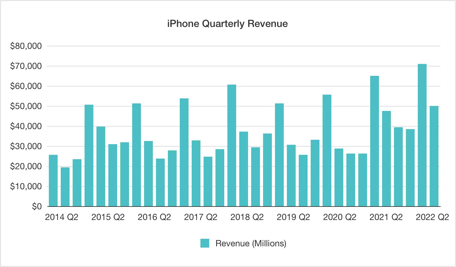
As a rule, column charts are employed to exhibit changes that occur over time or compare frequencies, percentages, and similar metrics across several groups or categories side by side. They help you spot differences and visualize rankings.
Line graph
A line graph can also display trends tracked over a certain period, but here, the changes are shown by a line that goes up and down along the time axis.
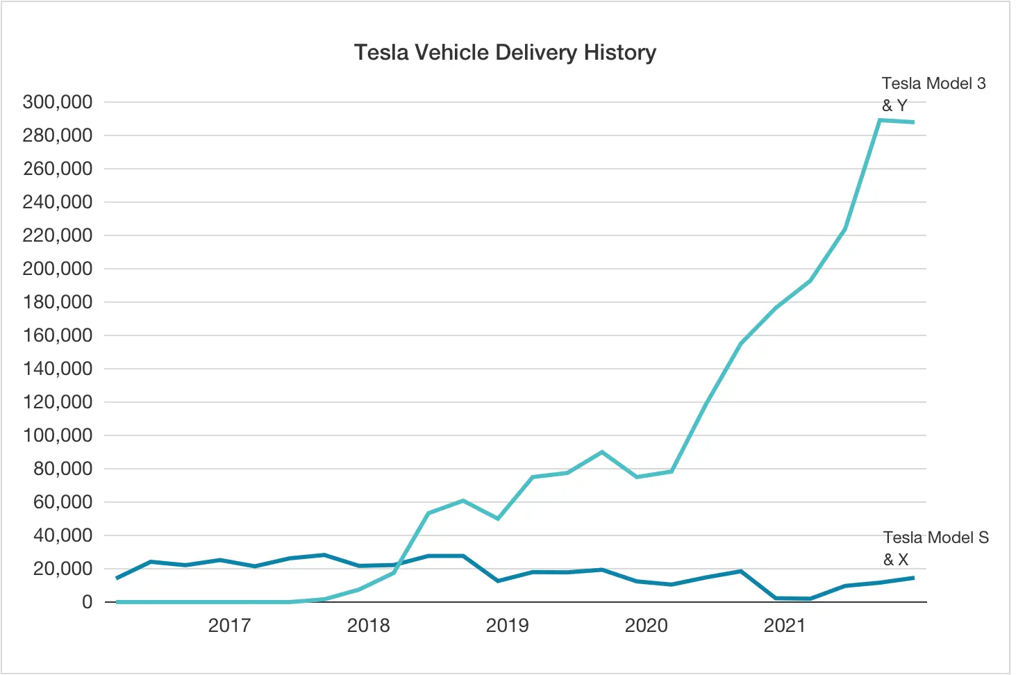
Such graphs offer a valuable comparative perspective when showing progress across multiple indices. Various types of line charts for data visualization can be utilized in the same use cases as column charts. Still, lines are considered to be more likely to be misinterpreted than columns, mainly when the chart contains multiple lines.
Scatter plot
Scatter plots depict multiple data points as circles or bubbles, revealing relationships between two variables represented by the circles' size and/or color.
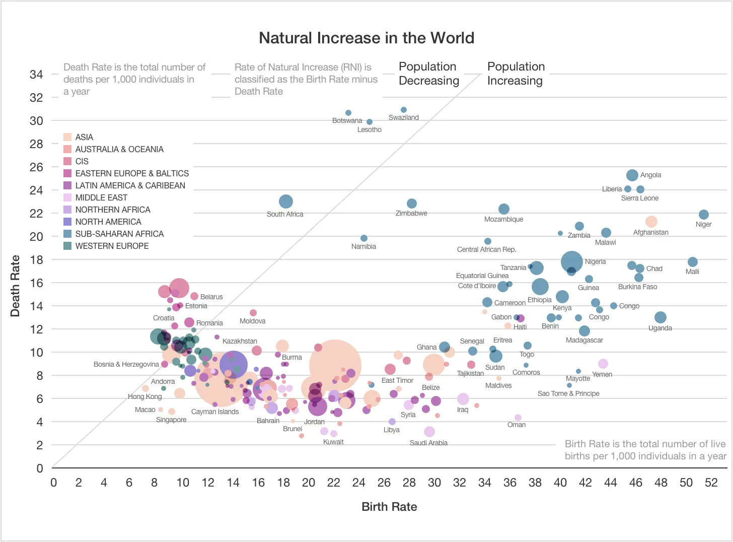
Moreover, this chart is exceptional at visualizing distribution patterns, enabling analysts to assess summary data quickly.
Bubble chart
As the name implies, bubble graphs represent data using bubbles, a variation of the scatter plot model. The distinction between the two lies in the number of values depicted in a single image (multiple for bubble charts) and the number of measurements per category (one per category in bubble charts).
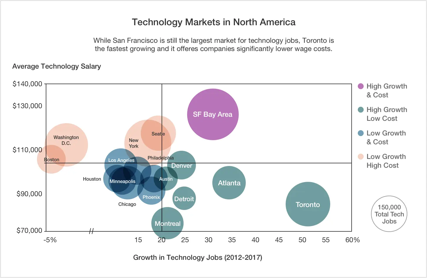
Bubble charts highlight the significance of a limited number of categories amidst a larger number of less significant ones. While commonly used in non-business fields like administration or ecology to advocate for political points, enterprise managers can also utilize them to emphasize areas of high spending or reveal misplaced priorities.
Network graph
Like any network model, this diagram represents relationships between entities using nodes and edges (or relationships). These elements expose connections, dependencies, and interactions between the nodes.
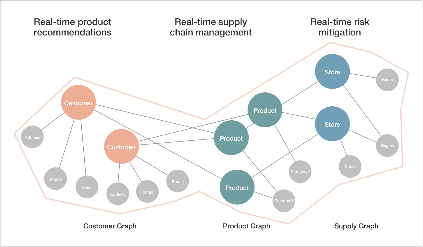
Commonly used in analyzing transportation networks, these graphs have one significant drawback: their complexity. Multiple connections and the absence of apparent patterns can make them cluttered and difficult to interpret.
Heat map
A heat map illustrates the correlation between two variables on a gradable scale from high to low. This correlation is represented by a color code, or gradients explained beneath the map.
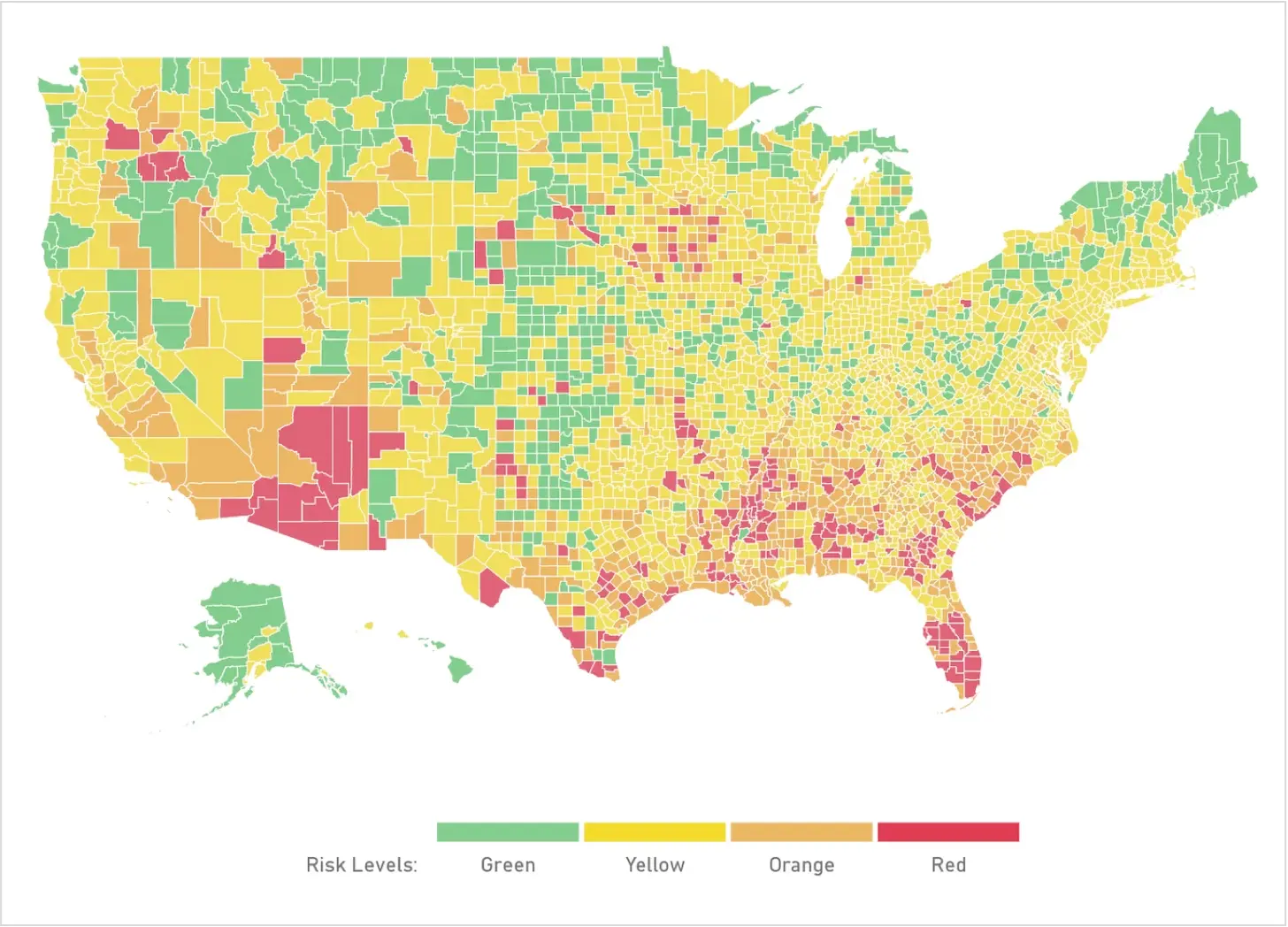
Such diagrams provide a broader overview of numerics and values without delving into nuances and details. They excel at visualizing the analysis of large datasets such as population density, customer base distribution, or website traffic indices.
Stacked bar chart
Similar to the previous example, color-code values are also important in stacked bar charts, but their variations are displayed within bars.
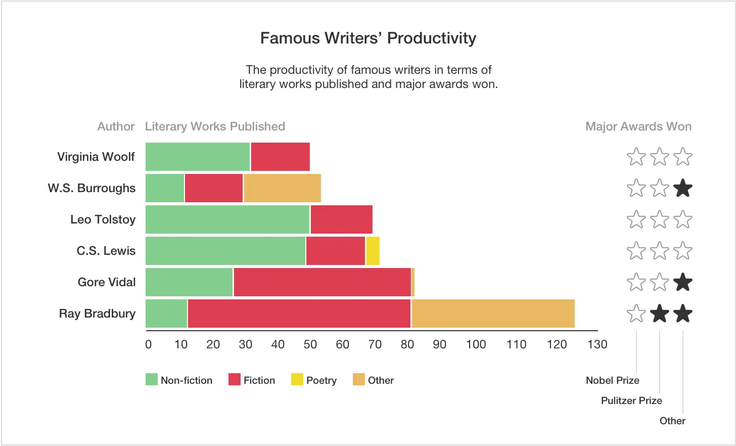
This technique is often employed in commerce to track sales performance over a specific timeline, segmented by the sales team.
Pie chart
True to its name, this chart resembles a circular graph with values represented as pie slices.
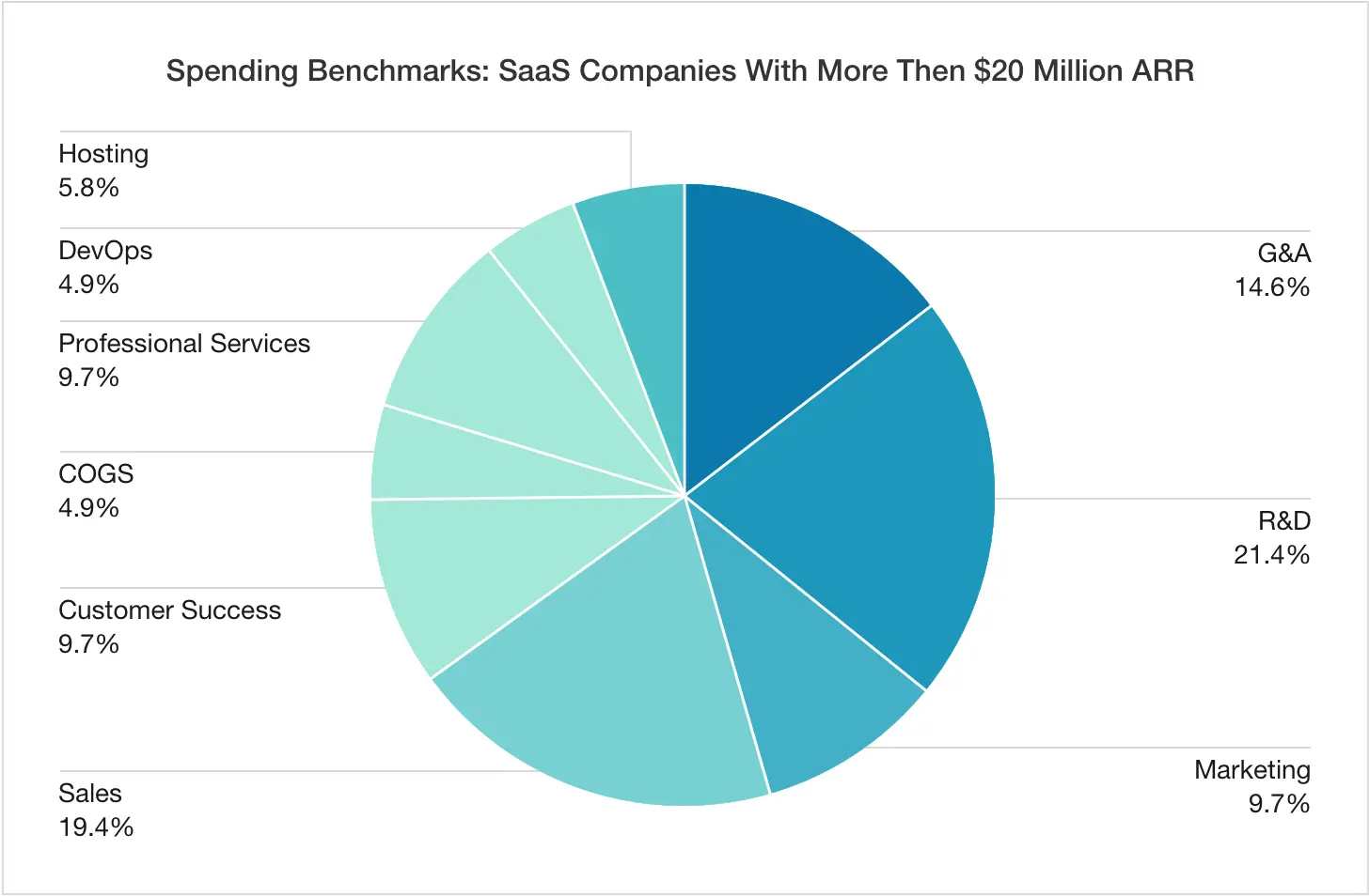
This diagram is an excellent visualization for data segmentation and percentage distribution across various categories, where the total sum equals 100%. It provides a much clearer understanding of their proportions compared to simple percentage listings. However, to ensure effectiveness and readability, the number of slices in such a pie should be at most 6-8, which imposes severe limitations on its usage.
Polar chart
Polar charts serve the same purpose of displaying data distribution within a single category, resembling the previous technique in appearance. However, here, each value's share is represented not by the angle size (which remains equal for all categories) but by the length of each sector, starting from the circle's center.
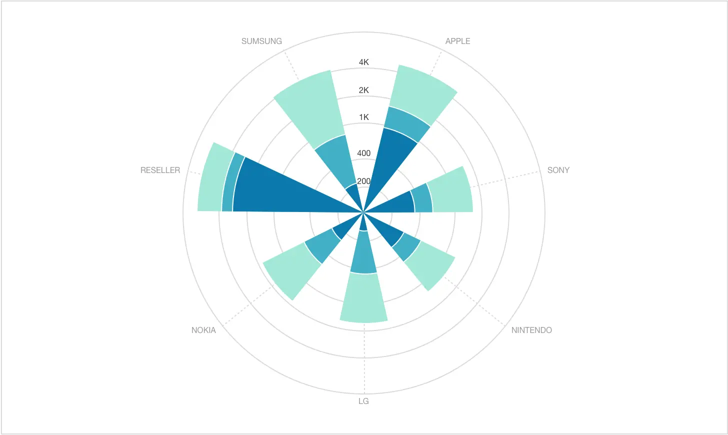
Each sector can feature color code variations, allowing this chart to be combined with the stacked bar graph.
Funnel chart
Typically, funnel charts are used to illustrate a progression through a path consisting of a series of steps.
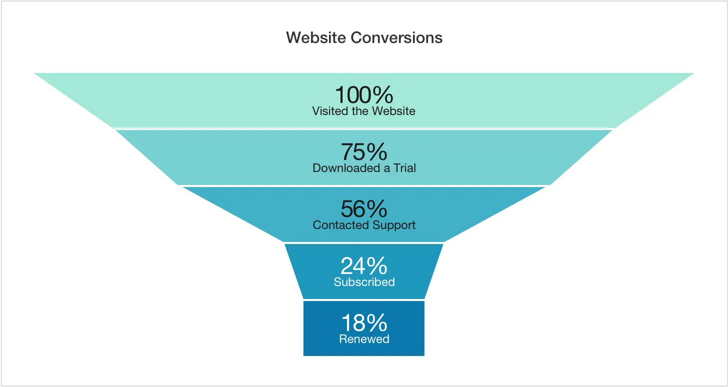
Since it's modeled on the universally known conversion funnel, this chart is perfect for representing website conversion indices, with the sequential data displayed at each stage.
As you can see, there is a wide range of visualization methods to choose from. Understanding when to use data visualization and what type to opt for is crucial to leverage them efficiently. Given the importance of the task, it's recommended to delegate it to experts in the domain.
Consider Dworkz as your trusted partner
Dworkz is a seasoned company specializing in various areas of IT-driven data science. Our high-profile experts are qualified to offer valuable advice on choosing the most effective data visualization methods tailored to your needs. Additionally, we provide consultation on minute yet vital details, like typography in charts, which can ultimately make or break your data processing endeavor. Contact us for a comprehensive scope of consulting services in the field of data visualization.
Final thoughts
Meticulous and accurate data analysis is crucial for efficient workflow across numerous contemporary commercial and non-commercial industries. However, even with all the available information on your table, correct interpretation and relevant conclusions are essential. Unarranged raw data is a tough nut to crack, but employing data visualization techniques can drastically streamline and facilitate this process.
Presenting multiple data sets in an easy-to-understand visual format ensures data accessibility across the organization, enables prompt data comparison and key point identification, exposes relationships and dominating trends, and accelerates decision-making routine.
Modern software tools offer an extensive roster of data visualization mechanisms, including column charts, stacked bar charts, line graphs, scatter plots, bubble charts, network graphs, heat maps, pie diagrams, and more. Each is designed to represent specific aspects and categories of data. To choose the one that suits your use case, it's wise to hire competent professionals in the realm.
