
Slicing and dicing
It is better not to use pie charts when displaying complicated relationships involving a large number of categories since it is easier to compare two vertical bars than it is to compare two pie slices.
Ineffective slice order
People tend to read from top to bottom and in a clockwise direction, so it is advisable not to place the slices in a clockwise order from smallest to largest since this would give the smallest section the most prominent position.

Too many slices
It becomes difficult to make comparisons when there are too many segments, so the pie chart should have no more than five slices.
When there are more than five categories, combine the smaller and less important ones into a fifth category called ‘Other’. In that case, if it is necessary for each category to be shown individually, a stacked or segmented bar chart should be used instead.

Position larger segments at the top
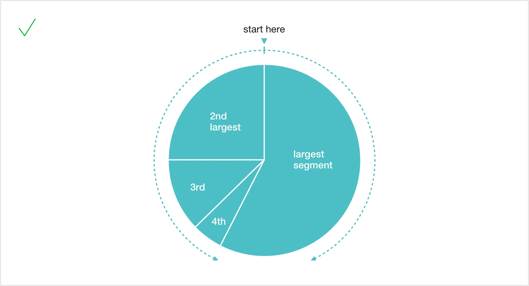
It is natural for people to look at pie charts as if they were a clock, beginning at 12 o’clock and going clockwise. In order to give the largest slice the greatest emphasis, position it at 12 o’clock and extend it to the right.
Place the second-largest slice to the left of twelve o’clock and arrange the other slices in a counterclockwise direction in descending order; in this way the smallest slice ends up near the bottom, where it receives less attention.
If the various slices are the same size, then use a different order: begin at twelve o’clock and place them in clockwise order from the largest to the smallest.
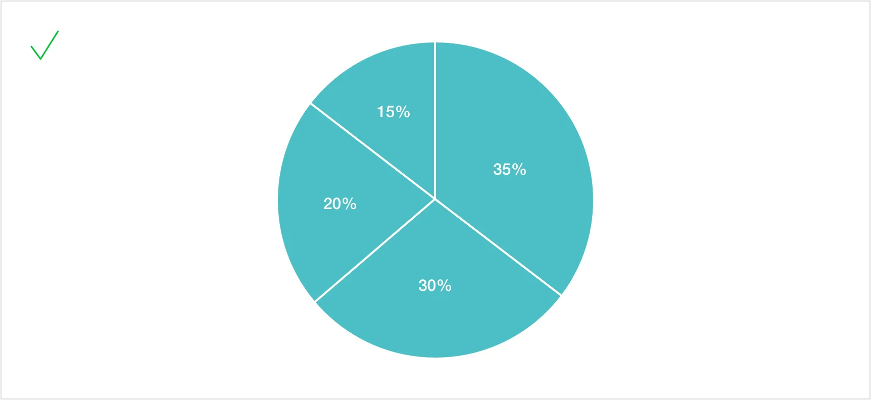
Just as with bar and line charts, putting labels directly on each segment helps readers to quickly recognise the categories and compare their values.
Keep pie charts simple
Pie charts are suitable for illustrating the different parts of a whole, whereas bar and line charts are more appropriate for use with complex data. It is advisable to avoid unnecessary variations in colour and 3D effects since such features can distract the reader or lead to a distorted perception of the proportions. All visual elements should contribute to the communication of the data.
Distracting colors and shades
Having too many colours or shades will distract attention from the data and make it more difficult to compare the slices.

Excessive visual effects
Highlight a section by using only one method. For instance, you could select either a contrasting shade or a pulled-out slice, not both.

Distorted proportions
A pie chart represents each slice by the area it occupies to show the portion of the whole. The addition of 3D effects distorts the proportions and may mislead readers.

Use simple shading
It is usually easier to compare lengths than it is to compare pie slices, so keep the shading simple in order that readers may easily see how each section relates to the whole.

Emphasize key slices
Use a contrasting shade to draw attention to one or two important segments.
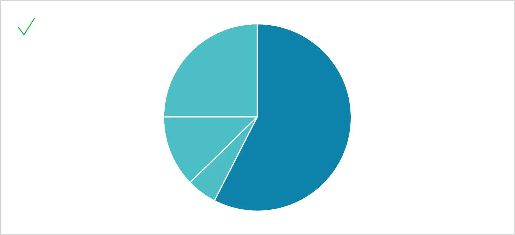
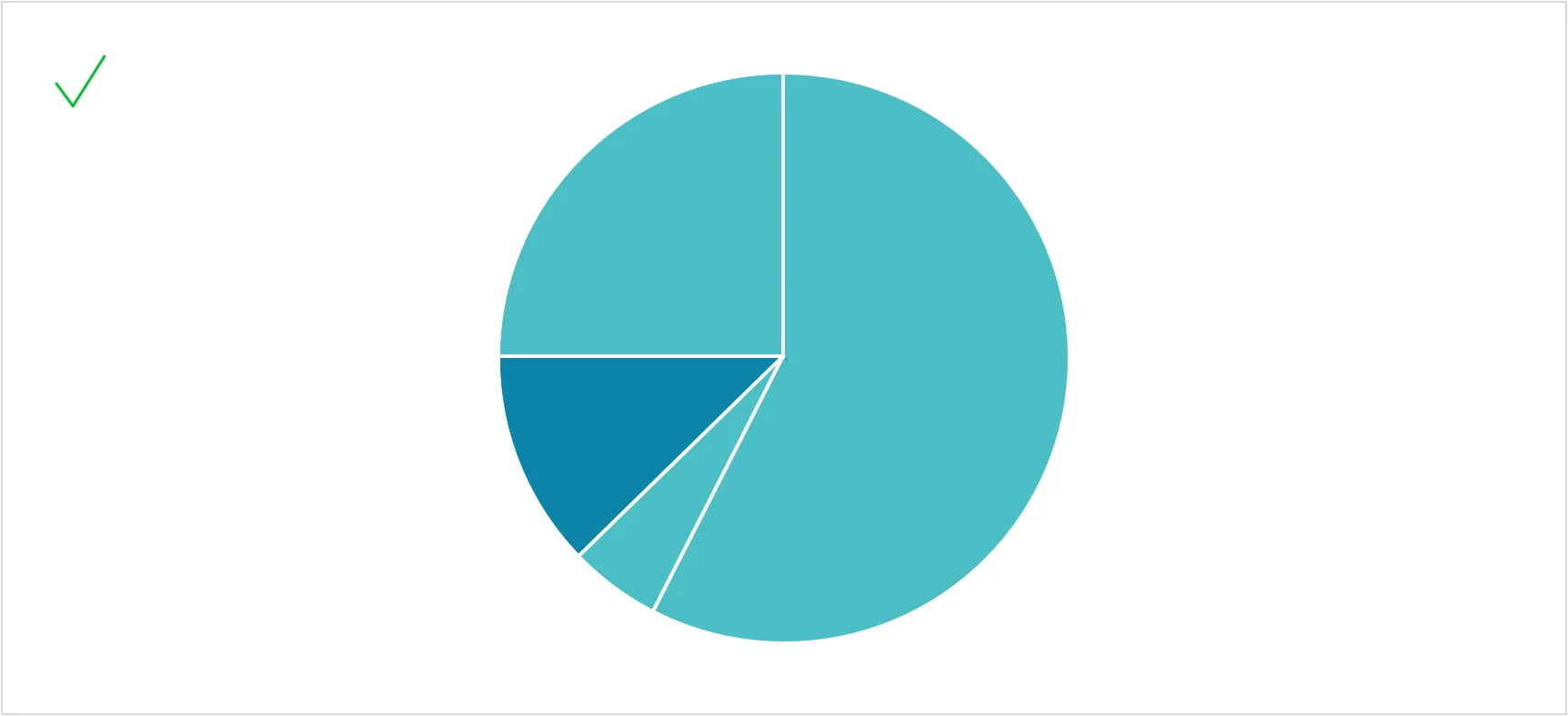
You can highlight any segment, regardless of its size, while keeping the slice order unchanged.
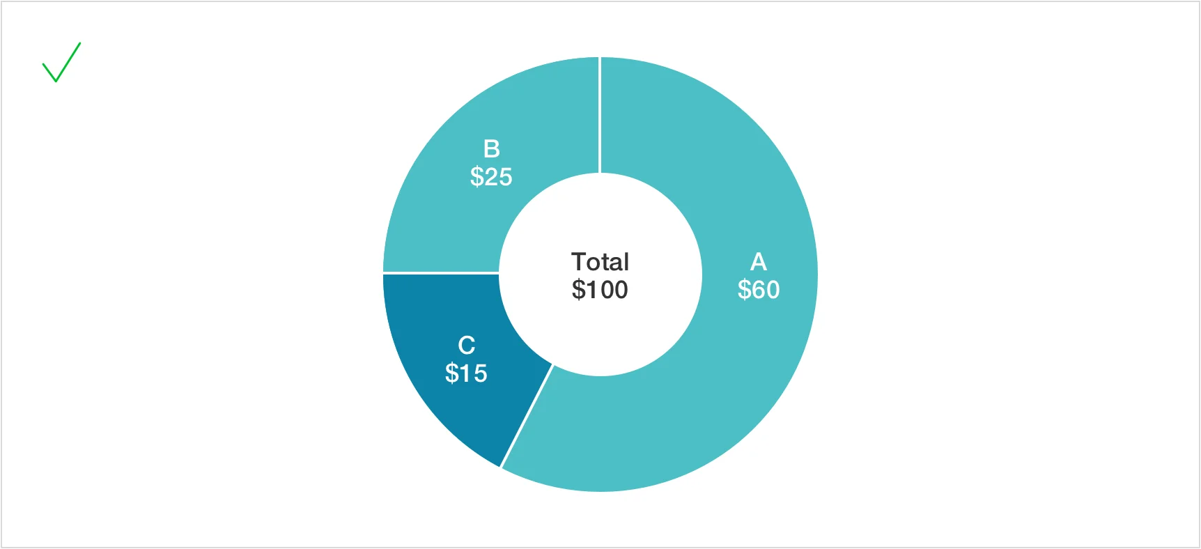
A donut chart lets you display the total value in its center.
Dividing a slice
Charts should communicate their message at a glance. Making readers calculate values in their heads undermines that purpose. Do the calculations for them.
Avoid subdividing pie slices
Pie charts are frequently used in business, but they are not always the best method for comparing different categories. When you divide one slice and put it into another pie chart, it becomes more difficult to see how each smaller section relates to the original total. Readers have to put in too much effort to understand the proportions.

Use a segmented bar instead of another pie
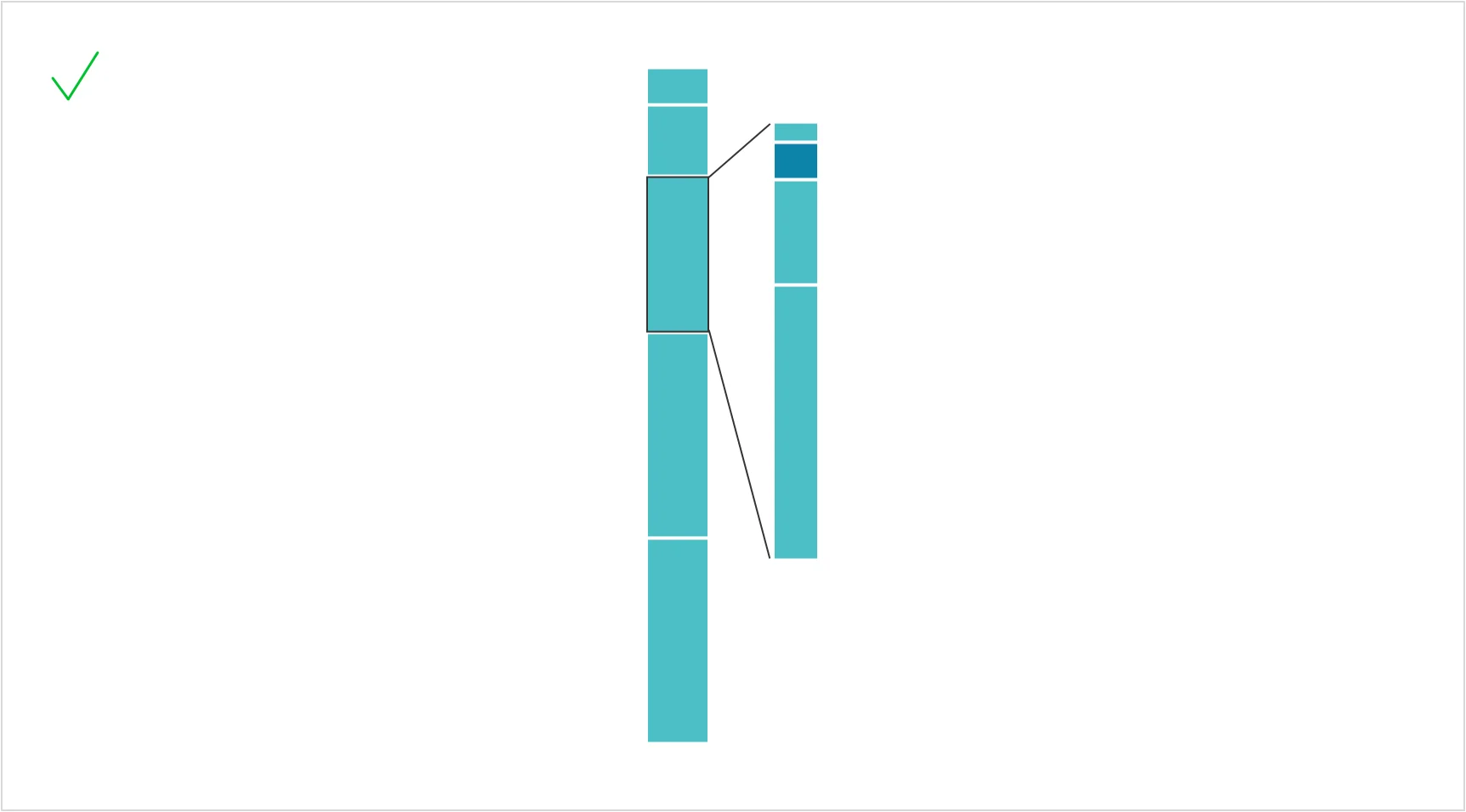
A segmented bar chart usually makes the various parts of a whole easier to see than a pie chart and is able to include more categories without becoming confusing. To provide readers with meaningful context, each segment should be labeled with both its percentage and its actual value.
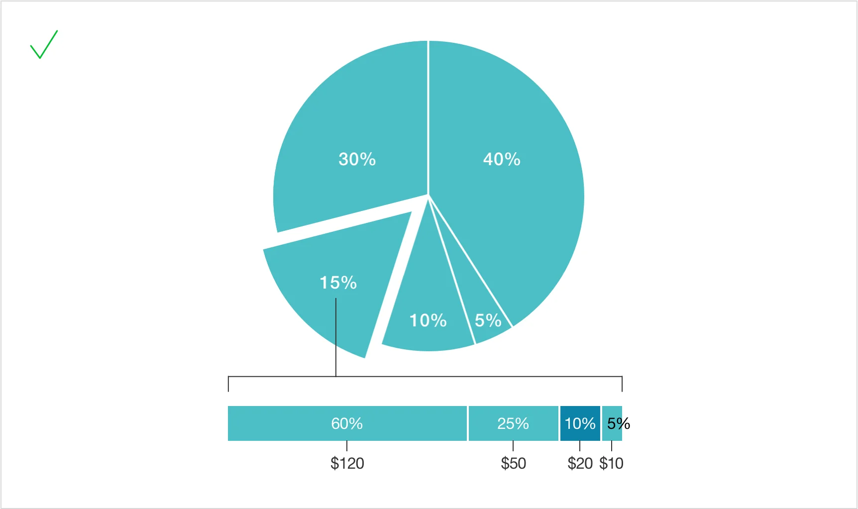
To show a further breakdown, connect a segment to a second segmented bar.
Proportional pie charts
It is advisable not to use donut charts when comparing proportional sizes since the empty centers can distort the relationship among the remaining areas and make it more difficult to compare the values accurately.
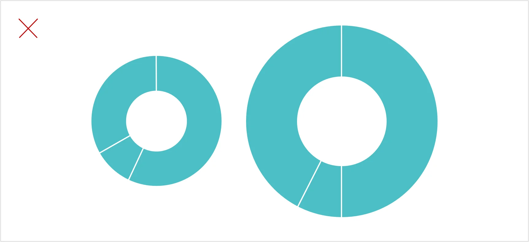
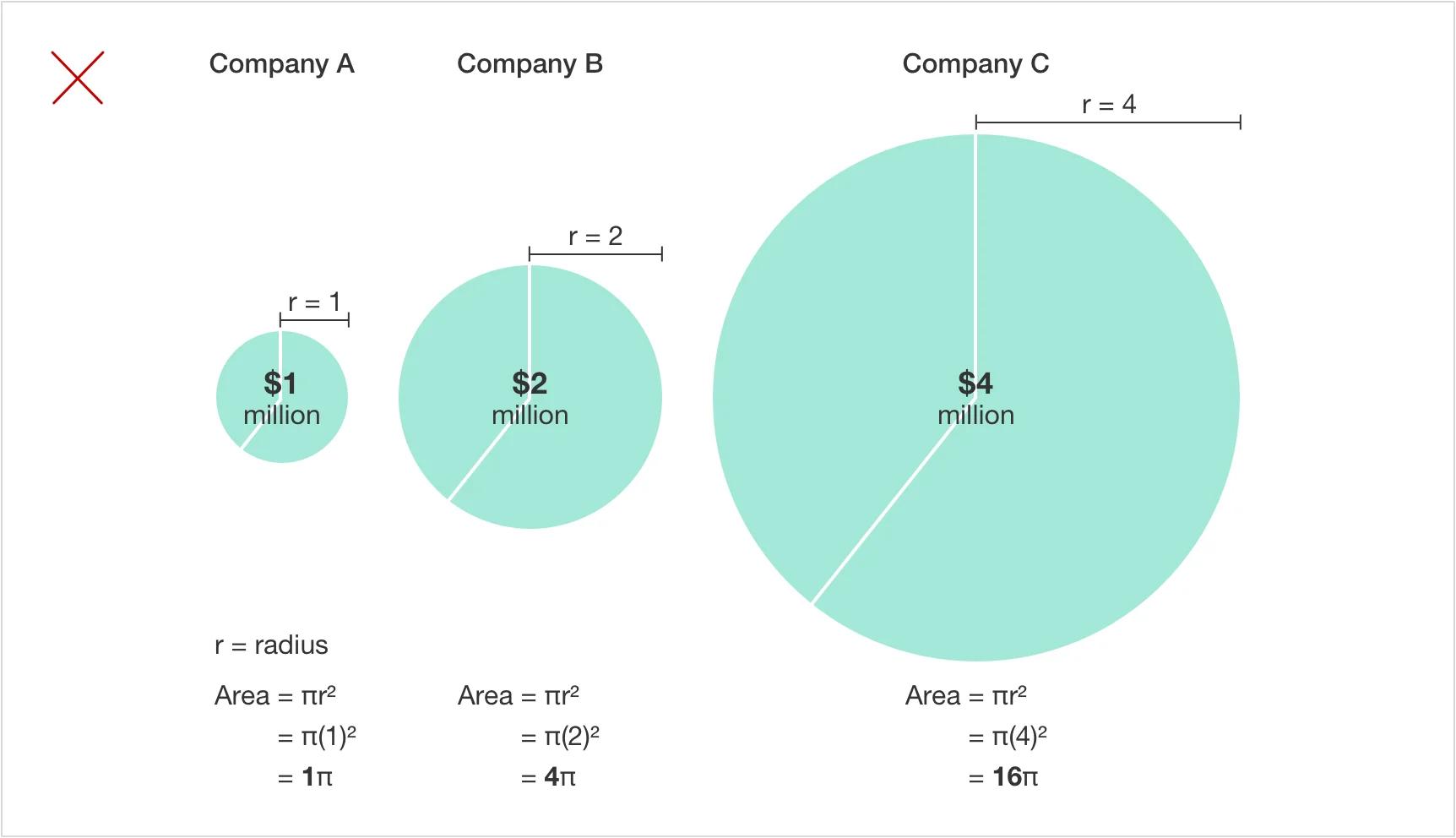
Distorted proportions from scaling the radius
It is a common error to scale circles according to their radii rather than their areas.
Radius ratio: 1:2:4
Resulting area ratio: 1:4:16
This exaggerates the differences between companies. Company C’s circle has 16 times the area of Company A’s, even though its value is only four times as large.

Scale circles by area
To represent values accurately, size proportional pie charts by their area using the formula Area = πr².
Radius ratio: approximately 1:1.414:2
Resulting area ratio: 1:2:4
This ensures the three pies accurately reflect the companies’ relative values of $1 million, $2 million, and $4 million.
Proportional pie charts show two things at once: how totals compare across charts and how each total is divided into segments.
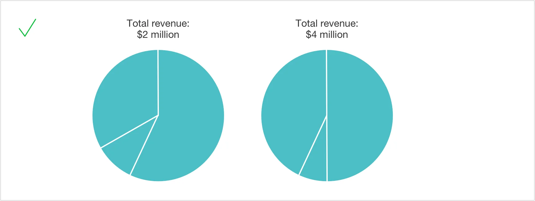
Pie charts of the same size can also be used to show different totals, as long as each total is clearly labeled.
Summary
Although pie charts have a very limited purpose, most visualization tools provide support for them. Donut charts are less commonly available and usually do not give a clear benefit compared to a standard pie chart. Even though pie charts are now less popular, they are still something that most readers are familiar with and are effective for illustrating how the individual parts contribute to the whole.
There are various ways of presenting data, one of which is through a pie chart; the appropriate choice will be determined by what you would like your readers to understand.
The following article from the Data Visualization series will discuss tables. Stay tuned and subscribe to our mailing list to ensure you get the following article on data visualization.
If you missed the previous six articles from the series, you can read them here: